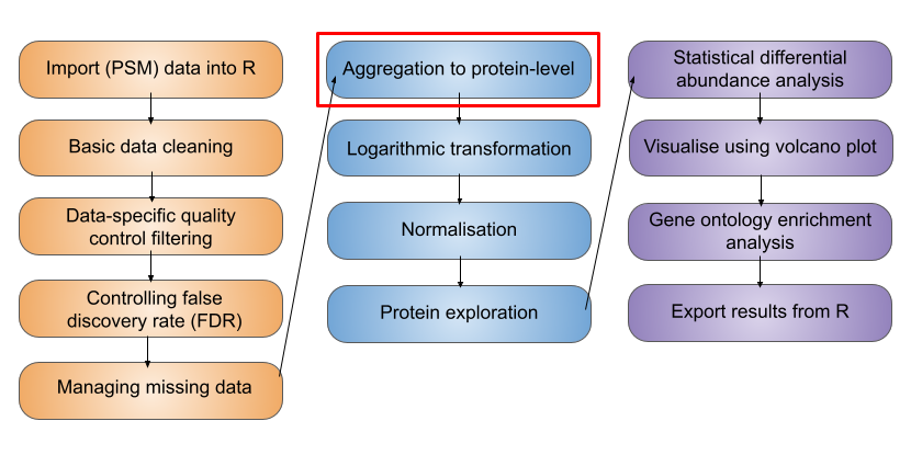
12 Data normalisation and data aggregation
TipLearning Objectives
- Be able to aggregate PSM-level information to protein-level using the
aggregateFeaturesfunction in theQFeaturesinfrastructure - Recognise the importance of log transformation (
logTransform) - Know how to normalise your data (using
normalize) and explore the most appropriate methods for expression proteomics data
Let’s start by recapping which stage we have reached in the processing of our quantitative proteomics data. In the previous two lessons we have so far learnt,
- how to import our data into R and store it in a
QFeaturesobject - work with the structure of
QFeaturesobjects - clean data using a series of non-specific and data-dependent filters
In this next lesson we will continue processing the PSM level data, aggregate our data to protein-level intensities, explore log transformation, and finally normalise the protein-level data ready for downstream statistical testing.
12.1 Feature aggregation
Let’s recap our data,
cc_qfAn instance of class QFeatures (type: bulk) with 2 sets:
[1] psms_raw: SummarizedExperiment with 45803 rows and 10 columns
[2] psms_filtered: SummarizedExperiment with 25687 rows and 10 columns Now that we are satisfied with our PSM quality, we need to aggregate our PSM level data upward to the protein level. In a bottom-up MS experiment we initially identify and quantify peptides. Further, each peptide can be identified and quantified on the basis of multiple matched spectra (the peptide spectrum matches, PSMs). We now want to group information from all PSMs that correspond to the same master protein accession.
To aggregate upwards from PSM to proteins we can either do this (i) directly (from PSM straight to protein, if we are not interested in peptide level information) or (ii) include an intermediate step of aggregating from PSM to peptides, and then from the peptide level to proteins. Which you do will depend on your biological question. For the purpose of demonstration, let’s perform the explicit step of PSM to peptide aggregation.
12.1.1 Step 1: Sum aggregation of PSMs to peptides
In your console run the aggregateFeatures function on your QFeatures object. We wish to aggregate from PSM to peptide level so pass the argument i = "psms_filtered" to specify we wish to aggregate the PSM data, and then pass fcol = "Sequence" to specify we wish to group by the peptide amino acid sequence.
cc_qf <- aggregateFeatures(
  cc_qf,
  i = "psms_filtered",
  fcol = "Sequence",
  name = "peptides",
  fun = base::colSums,
  na.rm = TRUE
)
  |
  |                                                                      |   0%
  |
|======================================================================| 100%cc_qfAn instance of class QFeatures (type: bulk) with 3 sets:
[1] psms_raw: SummarizedExperiment with 45803 rows and 10 columns
[2] psms_filtered: SummarizedExperiment with 25687 rows and 10 columns
[3] peptides: SummarizedExperiment with 17231 rows and 10 columns We see we have created a new set called peptides and summarised 25687 PSMs into 17231 peptides.
There are many ways in which we can combine the quantitative values from each of the contributing PSMs into a single consensus peptide or protein quantitation. Simple methods for doing this include calculating the peptide or master protein quantitation based on the mean, median or sum PSM quantitation. Although the use of these simple mathematical functions can be effective, using colMeans or colMedians can become difficult for data sets that still contain missing values. Similarly, using colSums can result in protein quantitation values being biased by the presence of missing values.
That said in this case when missing values are not a problem, colSums can provide a beneficial bias towards the more abundant PSMs or peptides, which are also more likely to be accurate. If missing values are present, an alternative would be to use MsCoreUtils::robustSummary, a state-of-the art aggregation method that is able to aggregate effectively even in the presence of missing values (Sticker et al. 2020). See the extended materials for an example of robust summarisation.
12.1.2 Step 2: Sum aggregation of peptides to proteins
Let’s complete our aggregation by now aggregating our peptide level data to protein level data. Let’s again use the aggregateFeatures function and pass fcol = "Master.Protein.Accessions" to specify we wish to group by "Master.Protein.Accessions".
cc_qf <- aggregateFeatures(
  cc_qf,
  i = "peptides",
  fcol = "Master.Protein.Accessions",
  name = "proteins",
  fun = base::colSums,
  na.rm = TRUE
)
  |
  |                                                                      |   0%
  |
|======================================================================| 100%cc_qfAn instance of class QFeatures (type: bulk) with 4 sets:
[1] psms_raw: SummarizedExperiment with 45803 rows and 10 columns
[2] psms_filtered: SummarizedExperiment with 25687 rows and 10 columns
[3] peptides: SummarizedExperiment with 17231 rows and 10 columns
[4] proteins: SummarizedExperiment with 3823 rows and 10 columns We see we have now created a new set with 3823 protein groups.
NoteProtein groups
Since we are aggregating all PSMs that are assigned to the same master protein accession, the downstream statistical analysis will be carried out at the level of protein groups. This is important to consider since most people will report “proteins” as displaying significantly different abundances across conditions, when in reality they are referring to protein groups.
NoteThe Two-Peptide Rule in Proteomics
Robust protein identification and quantification depend heavily on the number and quality of peptides detected for each protein. Whilst this workflow does not explicitly demonstrate filtering of single-peptide identifications (“one-hit wonders”), it is considered good practice to assess these carefully during downstream analysis. As a general rule of thumb, the use of at least two unique proteotypic peptides per protein is widely considered best practice. Major peer-reviewed proteomics journals, including Molecular & Cellular Proteomics and Journal of Proteome Research, commonly expect this standard in discovery-based studies to help control false discovery rates (FDR) and improve confidence in protein identification.Although quantification based on a single peptide can be acceptable in targeted workflows such as SRM or PRM, this generally requires that the peptide be well characterized, reproducibly detected, and manually validated. In contrast, discovery-driven proteomics experiments should typically adhere to the two-peptide guideline to maximise confidence, reproducibility, and peer-review acceptance.However, strict enforcement of the two-peptide rule may not always be feasible in studies involving non-model or poorly annotated organisms. In such cases, incomplete genomic or proteomic databases, limited sequence coverage, and high sequence homology can restrict confident identification to a single peptide. Researchers must then apply additional validation strategies, such as manual spectral inspection, orthogonal evidence, or cross-species homology assessment, to support protein identification and quantification.
12.2 Logarithmic transformation
We have now reached the point where we are ready to log2 transform the quantitative data. If we take a look at our current (raw) quantitative data we will see that our abundance values are dramatically skewed towards zero.
## Look at distribution of abundance values in untransformed data
cc_qf[["proteins"]] %>%
  assay() %>%
  longForm() %>%
  ggplot(aes(x = value)) +
  geom_histogram() +
  theme_bw() +
  xlab("Abundance (raw)")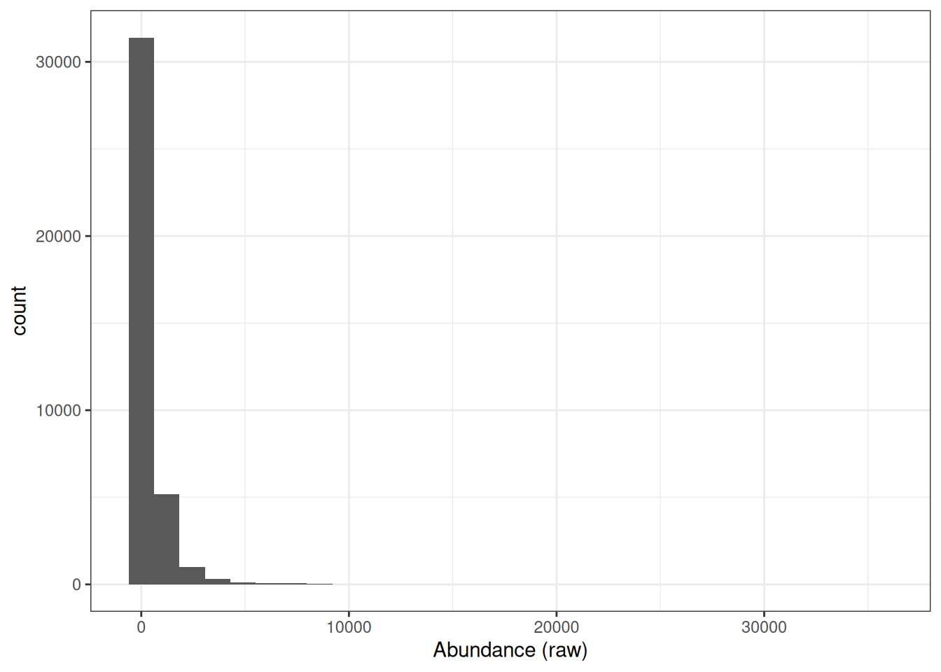
This is to be expected since the majority of proteins exist at low abundances within the cell or in serum and only a few are highly abundant. However, raw protein abundances are not normally distributed, which means parametric statistical tests cannot be applied directly.
Why does the skewed distribution matter? Consider a protein with abundance values of 0.25, 1, and 4 across three samples A, B, and C:
- Each step represents a 4-fold increase — the fold changes are equal.
- Yet on a linear scale, samples A and B (difference of 0.75) appear much closer together than B and C (difference of 3).
- A parametric test would treat these as unequal differences, introducing a systematic bias.
By applying a log2 transformation, the values become −2, 0, and +2 — evenly spaced — converting the skewed distribution into a symmetrical, approximately Gaussian distribution suitable for downstream statistical analysis.
NoteWhy use base-2?
Although there is no mathematical reason for applying a log2 transformation rather than using a higher base such as log10, the log2 scale provides an easy visualisation tool. Any protein that halves in abundance between conditions will have a 0.5 fold change, which translates into a log2 fold change of -1. Any protein that doubles in abundance will have a fold change of 2 and a log2 fold change of +1.
NoteAt which stage of the processing should I perform log transformation?
Logarithmic transformation can be applied at any stage of the data processing. This decision will depend upon the other data processing steps being completed and the methods used to do so. For example, many imputation methods work on log transformed data. We have chosen to log transform the data in this example after protein aggregation as we will use the colSums method for summarisation and this method requires the data to not be log transformed.
## Look at distribution of abundance values in untransformed data
cc_qf[["proteins"]] %>%
  assay() %>%
  longForm() %>%
  ggplot(aes(x = log2(value))) +
  geom_histogram() +
  theme_bw() +
  xlab("(Log2) Abundance")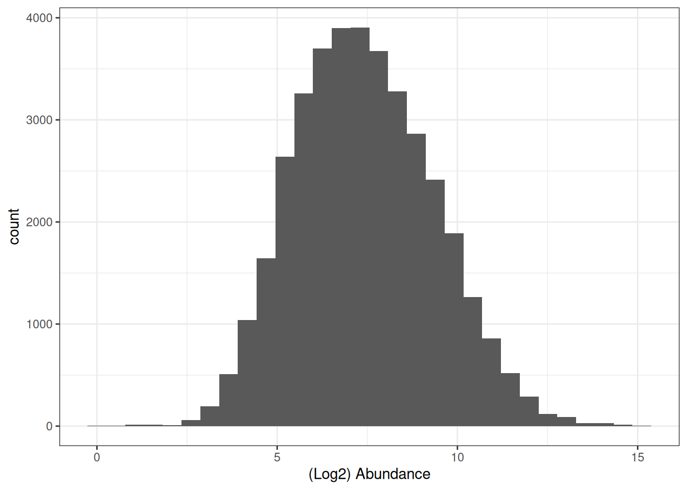
To apply this log2 transformation to our data we use the logTransform function and specify base = 2.
cc_qf <- logTransform(
  object = cc_qf,
  base = 2,
  i = "proteins",
  name = "log_proteins"
)
Let’s take a look again at our QFeatures object,
cc_qfAn instance of class QFeatures (type: bulk) with 5 sets:
[1] psms_raw: SummarizedExperiment with 45803 rows and 10 columns
[2] psms_filtered: SummarizedExperiment with 25687 rows and 10 columns
[3] peptides: SummarizedExperiment with 17231 rows and 10 columns
[4] proteins: SummarizedExperiment with 3823 rows and 10 columns
[5] log_proteins: SummarizedExperiment with 3823 rows and 10 columns 12.3 Normalisation of quantitative data
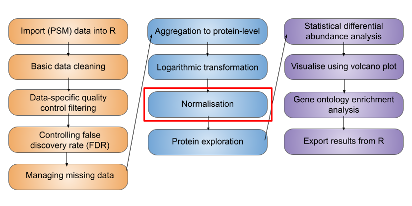
We now have log protein level abundance data to which we could apply a parametric statistical test. However, to perform a statistical test and discover whether any proteins differ in abundance between conditions, we first need to account for non-biological variance that may contribute to any differential abundance. Such variance can arise from experimental error or technical variation, although the latter is much more prominent when dealing with label-free DDA data, compared to TMT DDA or LFQ DIA.
Normalisation is the process by which we account for non-biological variation in protein abundance between samples and attempt to return our quantitative data back to its ‘normal’ condition i.e., representative of how it was in the original biological system. There are various methods that exist to normalise expression proteomics data and it is necessary to consider which of these to apply on a case-by-case basis. Unfortunately, there is not currently a single normalisation method which performs best for all quantitative proteomics datasets.
In QFeatures we can use the normalize function to apply normalisation. To see which methods are supported, type ?normalize to access the function’s help page.
Of the supported methods, median-based methods work well for most quantitative proteomics data. Unlike mean-based methods, median-based normalisation is less sensitive to the extreme values and outliers that are commonly present in proteomics datasets, making it a more robust choice for correcting sample-level systematic differences in loading or ionisation efficiency.
Median-based normalisation works by calculating a single correction factor per sample — the difference between that sample’s median abundance and a reference value — and applying it as a constant shift to every protein in that sample. This means all proteins in a given sample are shifted by the same amount, preserving the relative differences between proteins within each sample while bringing the overall distributions into alignment across samples.
We apply a center median normalisation, which shifts each sample’s distribution so that all sample medians are centered at zero.
cc_qf <- normalize(
  cc_qf,
  i = "log_proteins",
  name = "log_norm_proteins",
  method = "center.median"
)
Let’s verify the normalisation by viewing the QFeatures object. We can call experiments to view all the sets we have created,
experiments(cc_qf)ExperimentList class object of length 6:
[1] psms_raw: SummarizedExperiment with 45803 rows and 10 columns
[2] psms_filtered: SummarizedExperiment with 25687 rows and 10 columns
[3] peptides: SummarizedExperiment with 17231 rows and 10 columns
[4] proteins: SummarizedExperiment with 3823 rows and 10 columns
[5] log_proteins: SummarizedExperiment with 3823 rows and 10 columns
[6] log_norm_proteins: SummarizedExperiment with 3823 rows and 10 columns
ExerciseExercise 1 - Challenge 2: Visualising the data prior and post-normalisation
Level:
Create two boxplots pre- and post-normalisation to visualise the effect it has had on the data and add colour to distinguish between conditions.
AnswerAnswer
Using ggplot2,
pre_norm <- cc_qf[["log_proteins"]] %>%
  assay() %>%
  longForm() %>%
  ggplot(aes(x = colname, y = value)) +
  geom_boxplot() +
  labs(x = "Sample", y = "log2(abundance)", title = "Pre-normalization")

post_norm <- cc_qf[["log_norm_proteins"]] %>%
  assay() %>%
  longForm() %>%
  ggplot(aes(x = colname, y = value)) +
  geom_boxplot() +
  labs(x = "Sample", y = "log2(abundance)", title = "Post-normalization")

pre_norm + post_norm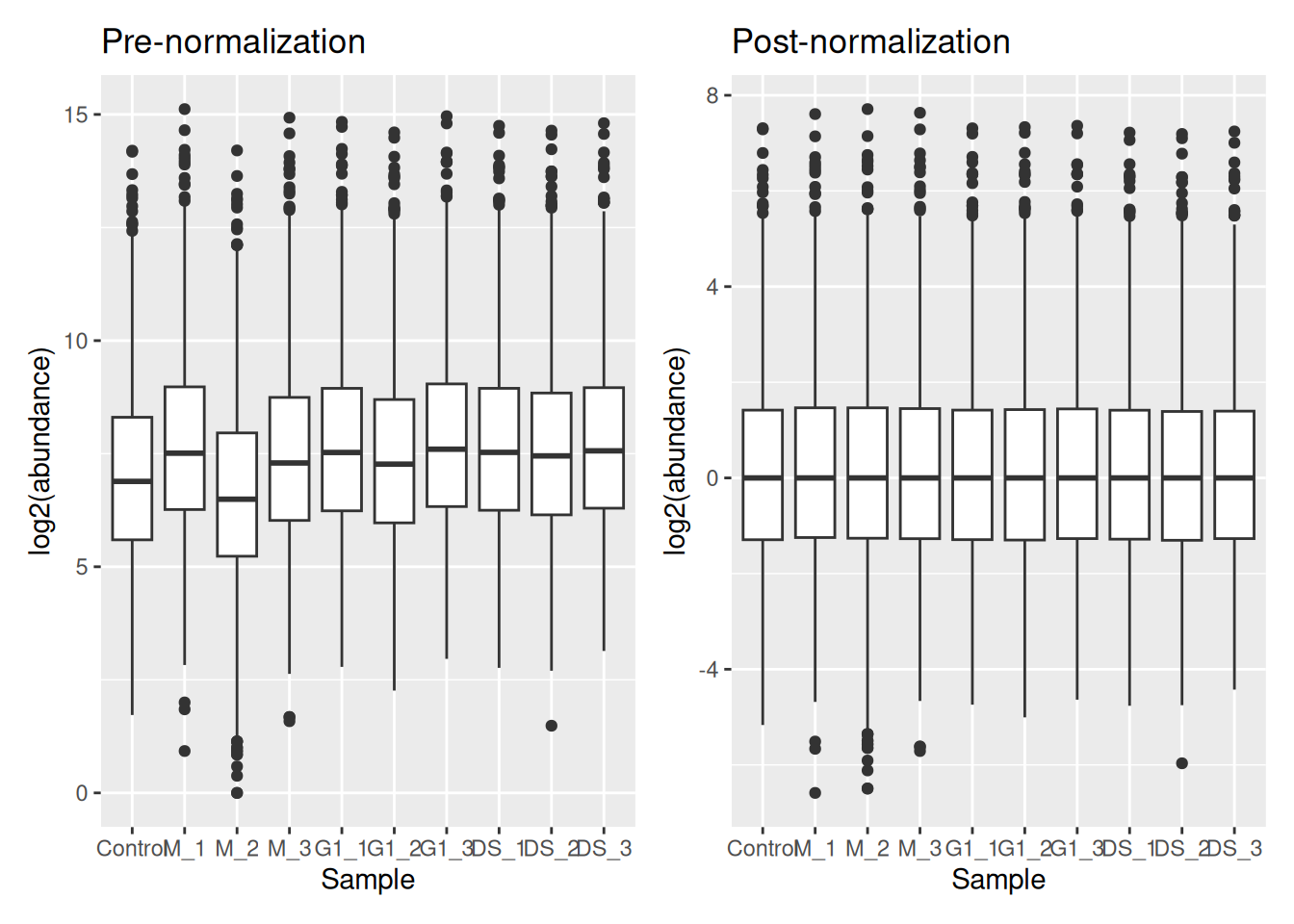
Colour coding by condition,
pre_norm <- cc_qf[["log_proteins"]] %>%
  assay() %>%
  longForm() %>%
  mutate(
    Condition = strsplit(as.character(colname), split = "_") %>%
      sapply("[[", 1)
  ) %>%
  ggplot(aes(x = colname, y = value, fill = Condition)) +
  geom_boxplot() +
  labs(x = "Sample", y = "log2(abundance)", title = "Pre-normalization") +
  theme(legend.position = "none")

post_norm <- cc_qf[["log_norm_proteins"]] %>%
  assay() %>%
  longForm() %>%
  mutate(
    Condition = strsplit(as.character(colname), split = "_") %>%
      sapply("[[", 1)
  ) %>%
  ggplot(aes(x = colname, y = value, fill = Condition)) +
  geom_boxplot() +
  labs(x = "Sample", y = "log2(abundance)", title = "Post-normalization")

pre_norm + post_norm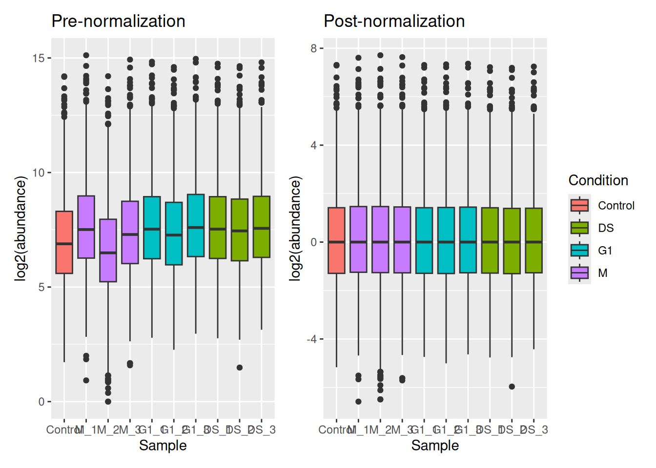
To visualise the effect that log transformation followed by normalisation has had on our data, we can also generate density plots. Density plots allow us to visualise the distribution of quantitative values in our data and to see where the majority of intensities lie.
ExerciseExercise 2 - Challenge 3: Visualising the impact of data transformation and normalisation
Level:
Create three density plots to visualise the distribution of intensities in (1) the raw protein data, (2) the log transformed protein data and (3) the log normalised protein data.
AnswerAnswer
Using plotDensities from the Limma package,
par(mfrow = c(1, 3)) ## Set up panel to hold three figures

cc_qf[["proteins"]] %>%
  assay() %>%
  plotDensities(legend = FALSE, main = "Raw proteins")

cc_qf[["log_proteins"]] %>%
  assay() %>%
  plotDensities(legend = FALSE, main = "Log2 proteins")

cc_qf[["log_norm_proteins"]] %>%
  assay() %>%
  plotDensities(legend = FALSE, main = "Log2 norm proteins")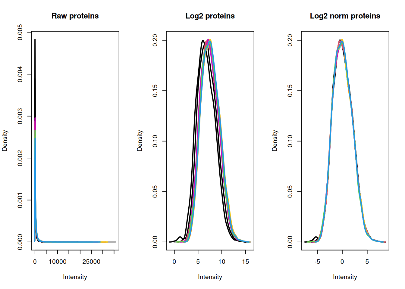
From our plots we can see that the center median normalisation has shifted the curves according to their median such that all of the final peaks are overlapping. This is what we would expect given that all of our samples come from the same cells and our treatment/conditions don’t case massive changes in the proteome.
To explore the use of alternative normalisation strategies, the NormalyzerDE Willforss et al. (2018) package can be used to compare normalisation approaches. Please refer to the Using NormalyzerDE to explore normalisation methods section.
TipKey Points
- Aggregation from lower level data (e.g., PSM) to high level identification and quantification (e.g., protein) is achieved using the
aggregateFeaturesfunction, which also creates explicit links between the original and newly createdsets. - Expression proteomics data should be log2 transformed to generate a Gaussian distribution which is suitable for parametric statistical testing. This is done using the
logTransformfunction. - To remove non-biological variation, data normalisation should be completed using the
normalizefunction. To help users decide which normalisation method is appropriate for their data we recommend using thenormalyzerfunction to create a report containing a comparison of methods.
References
Sticker, Adriaan, Ludger Goeminne, Lennart Martens, and Lieven Clement. 2020. “Robust Summarization and Inference in Proteome-Wide Label-Free Quantification.” Molecular &Amp\(\mathsemicolon\) Cellular Proteomics 19 (7): 1209–19. https://doi.org/10.1074/mcp.ra119.001624.
Willforss, Jakob, Aakash Chawade, and Fredrik Levander. 2018. “NormalyzerDE: Online Tool for Improved Normalization of Omics Expression Data and High-Sensitivity Differential Expression Analysis.” Journal of Proteome Research 18 (2): 732–40. https://doi.org/10.1021/acs.jproteome.8b00523.