limma_results_covid_control <- limma_results_all_contrasts %>%
filter(contrast == 'Covid19_control')8 Functional enrichment analysis
TipLearning Objectives
- Complete GO over-representation analysis using the
enrichGOfunction from theclusterProfilerpackage - Know how to reduce redundancy in GO enrichment results using semantic similarity with the
GOSemSimpackage - Be able to visualise and interpret the results of functional enrichment analyses
8.1 Biological interpretation of differentially abundant proteins
Having identified proteins with significantly different abundances between groups, we now aim to understand the biological processes and pathways these proteins are associated with. We use Gene Ontology (GO) over-representation analysis (ORA), which tests whether a selected list of proteins (e.g., those significantly decreased in COVID-19 vs Control) is enriched for particular GO terms relative to a background set of all quantified proteins.
We focus our analysis on the COVID-19 vs Control contrast, as this is the comparison of primary biological interest.
8.2 GO over-representation analysis
8.2.1 Gene Ontology (GO) enrichment analysis
One of the common methods used to probe the biological relevance of proteins with significant changes in abundance between conditions is to carry out Gene Ontology (GO) enrichment, or over-representation, analysis.
The Gene Ontology consortium have defined a set of hierarchical descriptions to be assigned to genes and their resulting proteins. These descriptions are split into three categories: cellular components (CC), biological processes (BP) and molecular function (MF). The idea is to provide information about a protein’s subcellular localisation, functionality and which processes it contributes to within the cell. Hence, the overarching aim of GO enrichment analysis is to answer the question:
“Given a list of proteins found to be differentially abundant in my phenotype of interest, what are the cellular components, molecular functions and biological processes involved in this phenotype?”.
Unfortunately, just looking at the GO terms associated with our differentially abundant proteins is insufficient to draw any solid conclusions. For example, if we find that 120 proteins significantly downregulated in our condition of interest are annotated with the GO term “kinase activity”, it may seem intuitive to conclude that reducing kinase activity is important for the phenotype of interest. However, if 90% of all proteins in the cell were kinases (an extreme example), then we might expect to discover a high representation of the “kinase activity” GO term in any protein list we end up with.
This leads us to the concept of an over-representation analysis. We wish to ask whether any GO terms are over-represented (i.e., present at a higher frequency than expected by chance) in our lists of differentially abundant proteins. In other words, we need to know how many proteins with a GO term could have shown differential abundance in our experiment vs. how many proteins with this GO term did show differential abundance in our experiment.
We use the enrichGO function from the clusterProfiler package to perform GO ORA on the proteins with significantly decreased abundance in COVID-19 patients relative to controls (adjusted p-value < 0.05 and negative log fold change). We test all three GO ontologies simultaneously (ont = "ALL").
sig_down <- limma_results_covid_control %>%
  filter(adj.P.Val < 0.05, logFC < 0) %>%
  pull(UniprotID)

go_down <- enrichGO(
  gene = sig_down, # list of down proteins
  universe = limma_results_covid_control$UniprotID, # all proteins
  OrgDb = org.Hs.eg.db, # database to query
  keyType = "UNIPROT", # protein ID encoding
  pvalueCutoff = 0.05,
  ont = "ALL", # can be CC, MF, BP, or ALL
  readable = TRUE
)
'select()' returned 1:1 mapping between keys and columnsWarning in bitr(gene, fromType = fromType, toType = "ENTREZID", OrgDb = OrgDb):
10.53% of input gene IDs are fail to map...'select()' returned 1:many mapping between keys and columnsWarning in bitr(gene, fromType = fromType, toType = "ENTREZID", OrgDb = OrgDb):
48.25% of input gene IDs are fail to map...8.2.2 Visualising significant GO terms
Discussion
- Looking at the GO enrichment results, why do we see so many similar or overlapping terms?
- What property of the Gene Ontology leads to this redundancy, and how might we address it?
We produce a dotplot of the significant GO terms, faceted by ontology (Biological Process, Molecular Function, Cellular Component). The size of each dot represents the number of proteins annotated with that term, and the colour indicates the adjusted p-value.
dotplot(
  go_down,
  x = "Count",
  font.size = 10,
  showCategory = Inf,
  label_format = 100,
  split = "ONTOLOGY",
  color = "p.adjust"
) +
  facet_grid(ONTOLOGY ~ ., scales = 'free_y', space = 'free_y')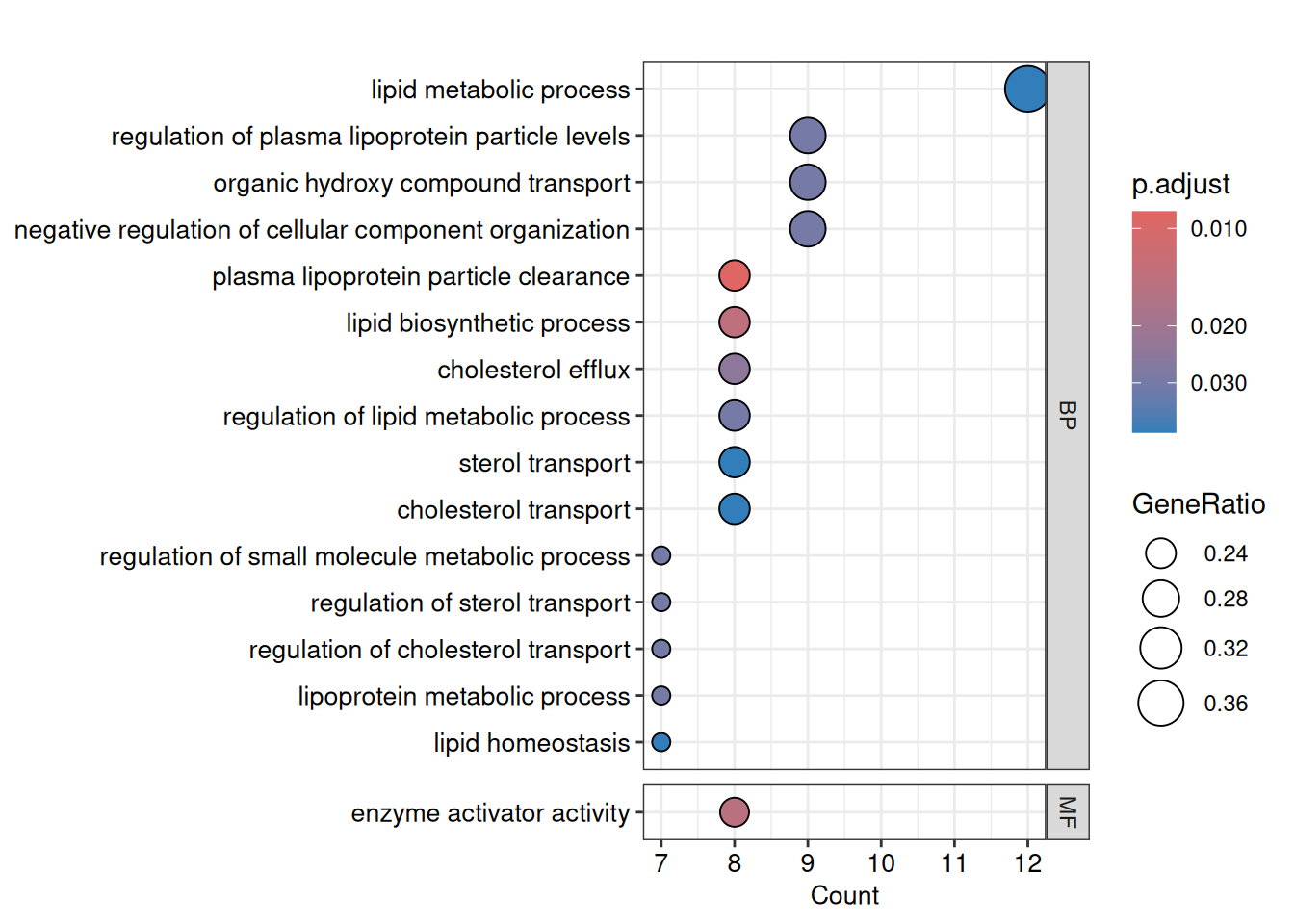
8.2.3 Reducing GO term redundancy using semantic similarity
GO terms are arranged in a hierarchy, meaning many significant terms will be related to one another. This leads to a long list of redundant results. The GOSemSim package can be used to compute pairwise semantic similarity between terms, and the simplify function from clusterProfiler can then remove highly similar terms, keeping only the most significant representative from each cluster.
gd <- godata('org.Hs.eg.db', ont = "BP")Warning in godata("org.Hs.eg.db", ont = "BP"): use 'annoDb' instead of 'OrgDb'preparing gene to GO mapping data...preparing IC data...go_down_similarity <- pairwise_termsim(go_down, method = "Wang", semData = gd)
go_down_simplified <- simplify(
go_down_similarity,
cutoff = 0.7, # similarity threshold for clustering
by = "p.adjust",
select_fun = min
)Warning: semData is not provided. It will be calculated automatically.Warning: semData is not provided. It will be calculated automatically.We can now re-visualise the simplified results, which should be more interpretable with less redundancy.
dotplot(
  go_down_simplified,
  x = "Count",
  font.size = 10,
  showCategory = Inf,
  label_format = 100,
  split = "ONTOLOGY",
  color = "p.adjust"
) +
  facet_grid(ONTOLOGY ~ ., scales = 'free_y', space = 'free_y')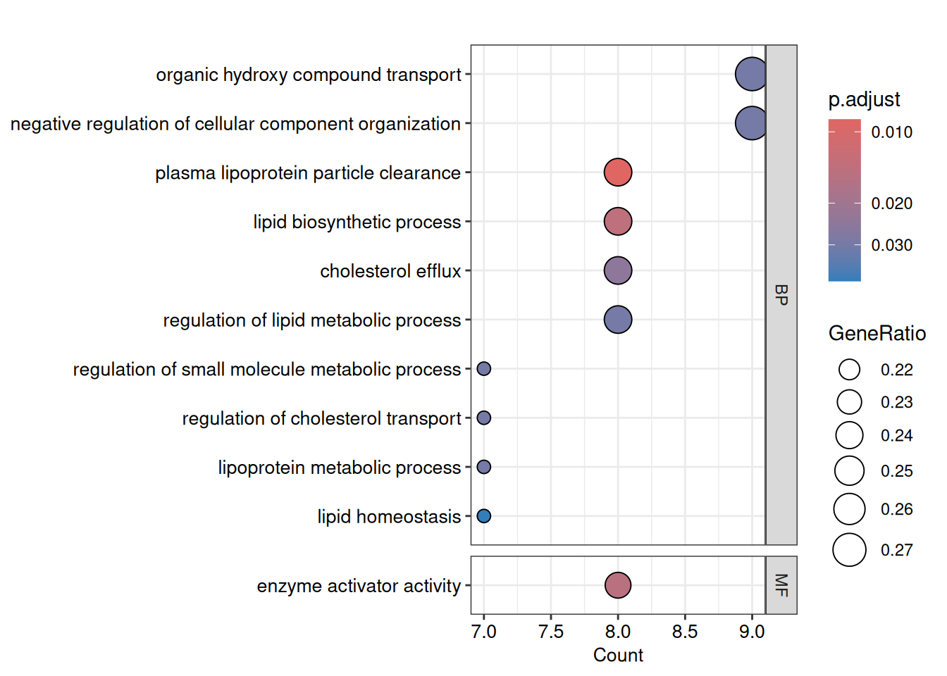
8.2.4 Visualising relationships between GO terms with a treeplot
The treeplot function from enrichplot hierarchically clusters the significant GO terms based on their pairwise semantic similarity and displays them as a tree, making the relationships between terms easier to interpret.
treeplot(
  go_down_similarity,
  showCategory = Inf,
  nCluster = 3,
  fontsize_tiplab = 2,
  fontsize_cladelab = 3,
  cladelab_offset = 6,
  tiplab_offset = 0.5,
  hexpand = 0.2
)
Warning: showCategory (Inf) is larger than available items (16). Using 16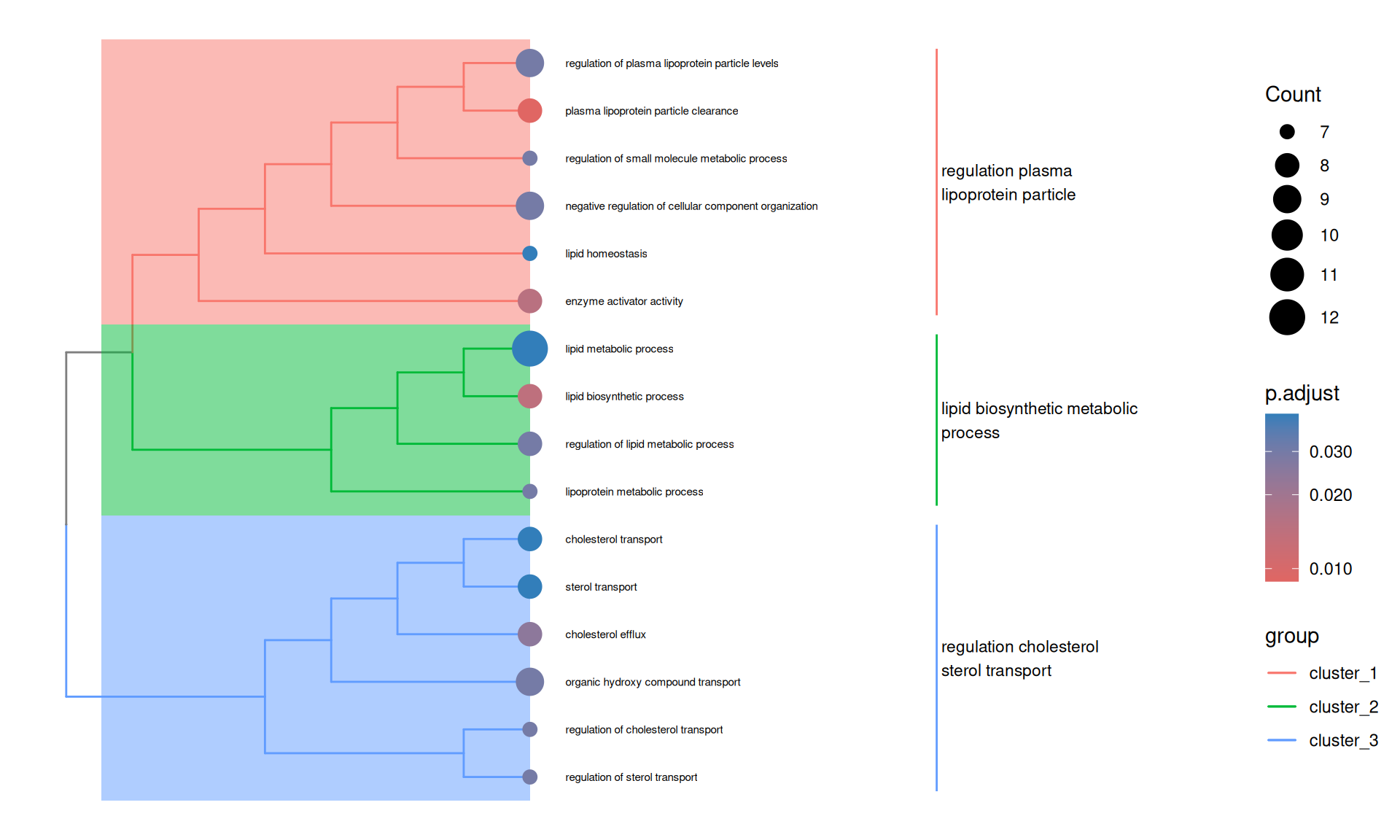
The treeplot provides a complementary view to the dotplot — rather than simply listing enriched terms, it reveals their biological relationships. Terms that cluster together share semantic similarity and likely reflect the same underlying biology. This makes it easier to summarise the enrichment results in terms of a small number of coherent biological themes rather than a long list of individually significant terms.
8.3 Linking GO results back to protein abundances
The GO enrichment results tell us which biological processes are over-represented among our proteins of interest, but it is often informative to go back and examine the sample-level abundance patterns for the proteins driving that enrichment.
Because we set readable = TRUE in our enrichGO call, the geneID column of the results contains gene symbols rather than Entrez IDs. We can extract these directly from the enrichment result and use AnnotationDbi::select to map them to UniProt accessions, filtering to proteins present in our experiment.
pm_lipo_part_clear <- go_down@result %>%
  filter(Description == "plasma lipoprotein particle clearance") %>%
  pull(geneID) %>%
  strsplit("/") %>%
  unlist()

# Gene symbol -> UniProt map
g2p <- AnnotationDbi::select(
  org.Hs.eg.db,
  keys = pm_lipo_part_clear,
  columns = "UNIPROT",
  keytype = "SYMBOL"
) %>%
  filter(UNIPROT %in% limma_results_covid_control$UniprotID)
'select()' returned 1:many mapping between keys and columnsprint(g2p) SYMBOL UNIPROT
1 APOC3 P02656
2 GPLD1 P80108
3 APOM O95445
4 APOA1 P02647
5 APOC2 P02655
6 ADIPOQ Q15848
7 APOC1 P02654
8 APOA2 P02652
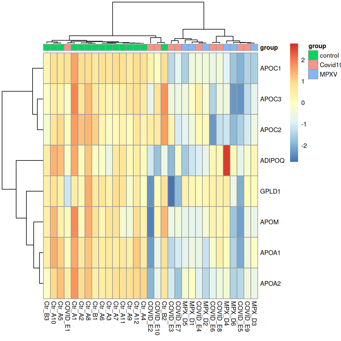
ExerciseExercise 1 - Challenge: Visualising abundances of plasma lipoprotein particle clearance proteins
Level:
Use the UniProt IDs retrieved above to assess whether the protein abundances for the ‘plasma lipoprotein particle clearance’ proteins are reliable. Then examine the abundance of these proteins across the samples using a heatmap. Do the samples cluster by condition on these proteins alone?
- Use
subsetByFeatureto subsetdia_qfto the features belonging to these proteins. Then plot the precursor-level and protein-level abundances side by side across samples, adapting the approach from the protein exploration notebook. - Plot a heatmap of the protein-level abundances for these proteins, with samples annotated by group. Do the samples separate as you would expect from the enrichment result?
Hint
Passrowvars = 'Genes' to longForm to carry gene names through to the plot, then facet by gene name and assay.
AnswerAnswer
# extract UniProt IDs for the proteins driving the enrichment of the 'plasma lipoprotein particle clearance' term
uids <- g2p$UNIPROT


# 1. Subset to the proteins of interest and
# plot precursor and protein level abundances across samples
dia_qf_lipids <- subsetByFeature(dia_qf, uids)

dia_qf_lipids[,, c("precursors_filtered_missing", "proteins")] %>%
  longForm(rowvars = c('Genes')) %>%
  as_tibble() %>%
  mutate(
    assay_order = factor(
      assay,
      levels = c("precursors_filtered_missing", "proteins")
    )
  ) %>%
  mutate(
    value = ifelse(assay == 'precursors_filtered_missing', log2(value), value)
  ) %>%
  ggplot(aes(x = colname, y = value, colour = assay)) +
  geom_point(size = 0.5) +
  geom_line(aes(group = rowname)) +
  theme_bw() +
  theme(
    axis.text.x = element_text(angle = 45, vjust = 1, hjust = 1, size = 7)
  ) +
  facet_grid(Genes ~ assay_order, scales = 'free') +
  labs(x = 'Sample', y = 'Abundance (log2)') +
  theme(aspect.ratio = 1 / 2)
Warning: 'experiments' dropped; see 'drops()'harmonizing input:
removing 155 sampleMap rows not in names(experiments)Warning: Removed 144 rows containing missing values or values outside the scale range
(`geom_point()`).Warning: Removed 34 rows containing missing values or values outside the scale range
(`geom_line()`).
# 2. Protein-level heatmap for plasma lipoprotein particle clearance proteins
sample_annotations <- colData(dia_qf) %>%
  data.frame() %>%
  tibble::remove_rownames() %>%
  tibble::column_to_rownames("runCol") %>%
  select(group)

quant_mtx <- assay(dia_qf[["norm_proteins_replicated"]][uids, ])
colnames(quant_mtx) <- dia_qf$runCol

rownames(quant_mtx) <- rowData(dia_qf[["norm_proteins_replicated"]][
  uids,
])$Genes

dist_cols <- as.dist(1 - cor(quant_mtx, use = "pairwise.complete.obs"))
dist_rows <- as.dist(1 - cor(t(quant_mtx), use = "pairwise.complete.obs"))

pheatmap(
  quant_mtx,
  scale = "row",
  annotation_col = sample_annotations,
  clustering_distance_rows = dist_rows,
  clustering_distance_cols = dist_cols,
  clustering_method = 'ward.D2',
  fontsize = 8
)
TipKey Points
- GO over-representation analysis tests whether a set of proteins of interest is enriched for particular biological annotations relative to a background set; the background should be all proteins quantified in the experiment
- GO results often contain many redundant terms due to the hierarchical nature of the GO; semantic similarity-based methods (e.g.,
GOSemSim) can reduce this redundancy to make results more interpretable - Visualising the relationships between significant GO terms (e.g., with
enrichplot::treeplot) can help to summarise results in terms of a small number of coherent biological themes rather than a long list of individual terms - Linking GO results back to the underlying data can help to validate and interpret the enrichment results, and reveal whether the proteins driving the enrichment show the expected abundance patterns across samples