Know how to produce heatmaps of protein abundance data using pheatmap, including with correlation-based clustering
Understand how to define and use a helper function to repeatedly plot heatmaps for different protein subsets
Be able to produce a scatter plot comparing log fold changes across two contrasts to identify proteins with shared or specific responses
Having performed differential abundance analysis, we now want to visualise the results in ways that complement the volcano plots produced in the previous lesson. In this lesson we produce heatmaps to display protein abundance patterns across all samples simultaneously, and scatter plots to compare fold changes across contrasts to identify proteins with shared or condition-specific responses.
7.1 Heatmaps
Discussion
What are we trying to learn from a heatmap of protein abundances? What patterns would you look for?
Which proteins would you choose to plot — all quantified proteins, significant proteins, or the most variable? What are the trade-offs of each approach?
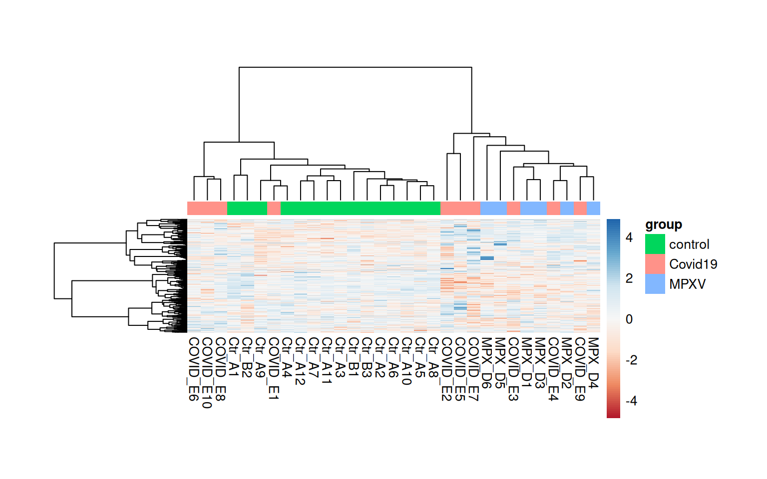
A heatmap provides a two-dimensional view of protein abundances across all samples simultaneously, and is commonly used alongside hierarchical clustering to reveal groups of proteins and samples with similar abundance patterns.
7.1.1 All replicated proteins
We start by plotting a heatmap of all proteins that were retained after the replication filter in the statistical analysis. We rename the sample columns using the runCol column from the colData and add a column annotation bar to indicate group membership.
The default Euclidean distance metric used for hierarchical clustering in pheatmap can be sensitive to the absolute scale of values. An alternative is to use 1 minus the Pearson correlation as a distance metric, which focuses on the shape of abundance profiles rather than their absolute values.
We could use clustering_distance_rows = "correlation" within pheatmap, but this does not handle missing values. Instead, we calculate the correlation-based distance manually using cor with use = "pairwise.complete.obs" to handle missing values appropriately. We also use Ward’s minimum variance method (clustering_method = 'ward.D2') for the hierarchical clustering, which tends to produce more compact, evenly-sized clusters than the default complete linkage. Using scale = 'row' standardises each row to mean=0 and sd=1 (Z-score), which allows us to focus on relative abundance patterns across samples for each protein.
quant_mtx <-assay(dia_qf[["norm_proteins_replicated"]])# Rename the samples with their runColcolnames(quant_mtx) <- dia_qf$runColsample_annotations <-colData(dia_qf) %>%data.frame() %>% tibble::remove_rownames() %>% tibble::column_to_rownames('runCol') %>%select(group)head(sample_annotations)
# Calculate correlation-based distance manually, handling NAs with pairwise complete obsdist_cols <-as.dist(1-cor(quant_mtx, use ="pairwise.complete.obs"))dist_rows <-as.dist(1-cor(t(quant_mtx), use ="pairwise.complete.obs"))pheatmap( quant_mtx,scale ='row', # standardise each row to mean=0 and sd=1 (Z-score)show_rownames =FALSE,annotation_col = sample_annotations,clustering_method ='ward.D2', # Use Ward's method for hierarchical clusteringclustering_distance_rows = dist_rows,clustering_distance_cols = dist_cols,color =colorRampPalette(brewer.pal(n =7, name ="RdBu"))(100), # Use a diverging color paletteannotation_names_col =FALSE, # Hide annotation titletreeheight_row =100, # default is 50 — increase to give row dendrogram more spacetreeheight_col =100, # default is 50 — increase to give col dendrogram more spacecellwidth =10, # fix cell width in pointscellheight =0.25)
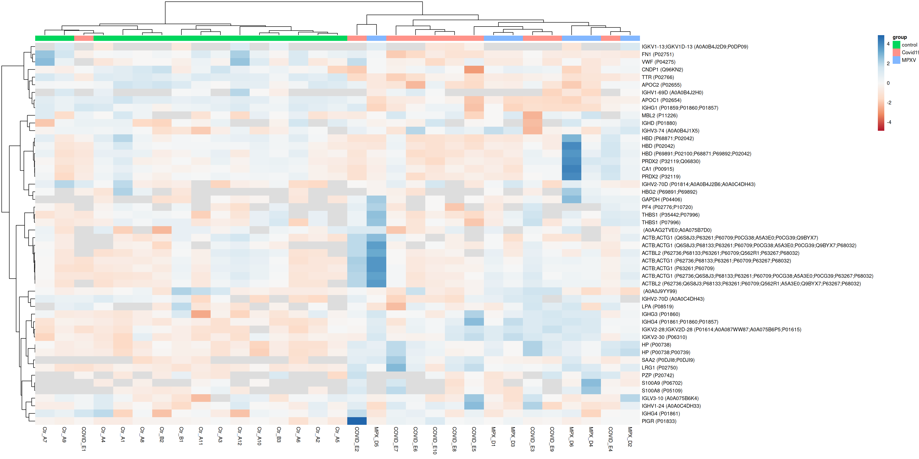
Since we will be making multiple heatmaps below with different subsets of proteins, it is useful to define a helper function rather than repeating the same code each time. This keeps each subsequent heatmap call concise and ensures all plots are produced in the same way.
The function below takes a vector of UniProt IDs, extracts the corresponding rows from the quantification matrix, applies the correlation-based distance metrics, and calls pheatmap with consistent formatting.
plot_heatmap_for_uids <-function(uids) { quant_mtx <-assay(dia_qf[["norm_proteins_replicated"]][uids, ])colnames(quant_mtx) <- dia_qf$runCol# Use concatenation of UniprotID and Gene name as row labelrownames(quant_mtx) <-sprintf('%s (%s)',rowData(dia_qf[["norm_proteins_replicated"]][uids, ])$Genes,rownames(quant_mtx) )# Calculate correlation-based distance manually, handling NAs with pairwise complete obs dist_cols <-as.dist(1-cor(quant_mtx, use ="pairwise.complete.obs")) dist_rows <-as.dist(1-cor(t(quant_mtx), use ="pairwise.complete.obs"))pheatmap( quant_mtx,scale ='row',clustering_method ='ward.D2',annotation_names_col =FALSE,color =colorRampPalette(brewer.pal(n =7, name ="RdBu"))(100),annotation_col = sample_annotations,clustering_distance_rows = dist_rows,clustering_distance_cols = dist_cols,fontsize =8 )}
7.1.2 Heatmap for the most variable proteins
Plotting all proteins can make it difficult to see structure. A common approach is to restrict the heatmap to the most variable proteins, which are more likely to reveal biologically meaningful patterns.
var <-rowVars(assay(dia_qf[["norm_proteins_replicated"]]), na.rm =TRUE)most_variable <-sort(var, decreasing =TRUE)[1:50] %>%names()plot_heatmap_for_uids(most_variable)
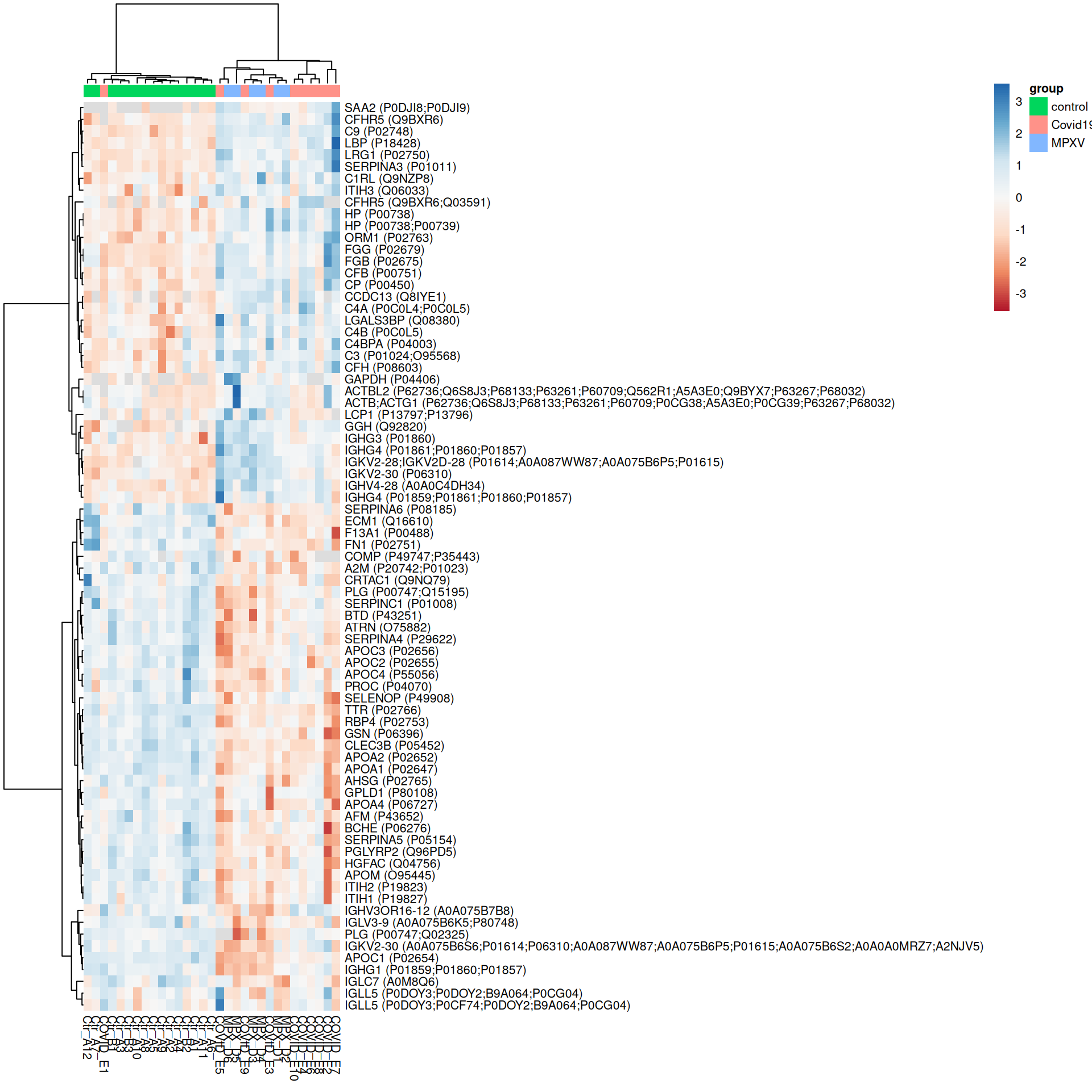
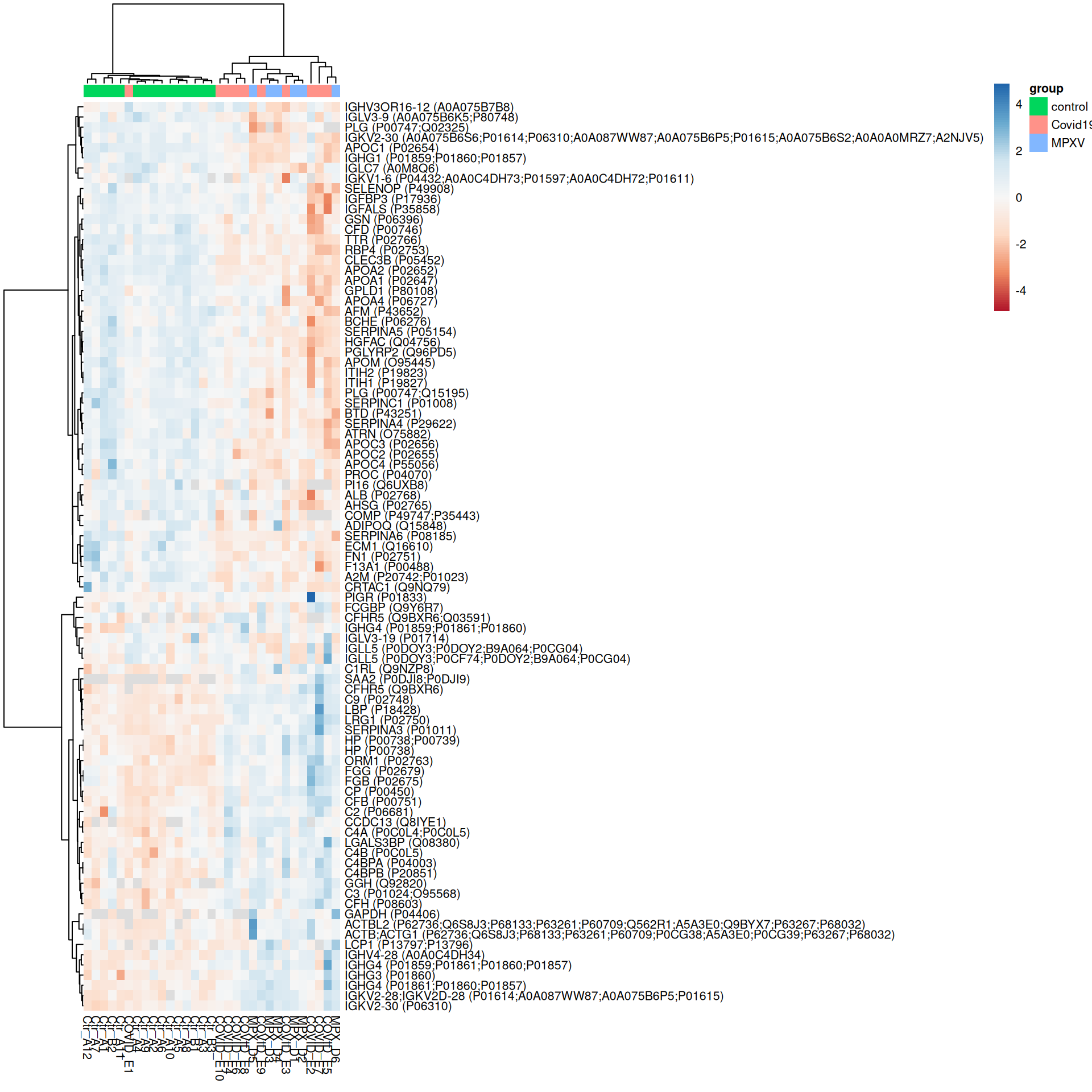
ExerciseExercise 1 - Challenge: Heatmaps of significant proteins
Level:
We have already defined the plot_heatmap_for_uids helper function and have F-test and pairwise contrast results available. Use these to produce heatmaps for:
Proteins with a significant overall difference across groups according to the F-test (adj.P.Val < 0.05)
Proteins significant (adj.P.Val < 0.05) in at least one pairwise contrast
For each heatmap, consider:
How do the proteins and samples cluster?
Do the sample groups separate cleanly?
How does restricting to significant proteins change the heatmap compared to the most variable proteins plotted above?
Hint
Filter limma_results_F and limma_results_all_contrasts to get the UniProt IDs of significant proteins, then pass these to plot_heatmap_for_uids.
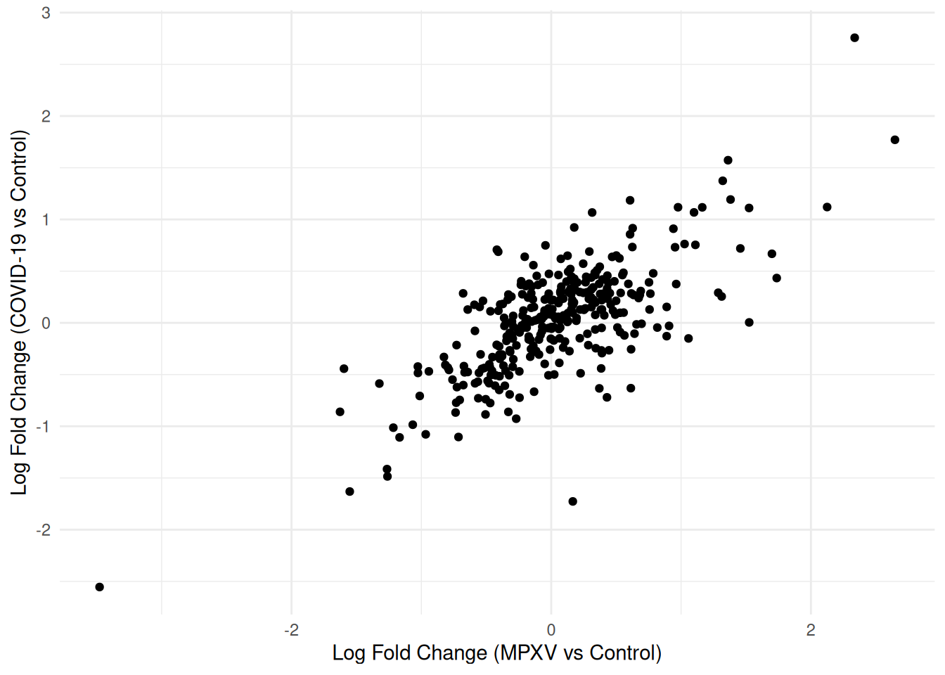
A scatter plot of log fold changes from two contrasts — here MPXV vs Control and COVID-19 vs Control — is one way to visualise to what extent the response to both infections is shared or infection-specific.
We first use pivot_wider to reshape the results so that each protein occupies a single row, with separate columns for the log fold change and adjusted p-value from each contrast.
We can now plot the log fold changes against each other.
compare_limma_results %>%ggplot(aes(x = logFC_MPXV_control, y = logFC_Covid19_control)) +geom_point() +theme_minimal() +labs(x ="Log Fold Change (MPXV vs Control)",y ="Log Fold Change (COVID-19 vs Control)" )
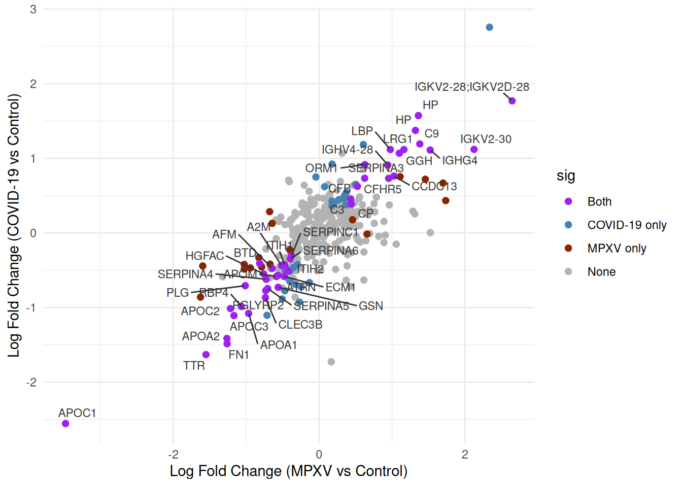
We’d like to highlight the significance status of each protein across the two contrasts. We can create a sig column that categorises each protein by its significance status across the two contrasts, distinguishing proteins significant in both, in only one, or in neither.
Now we can re-plot the log fold changes against each other, colouring points by significance category. We will label only those significant in both contrasts to keep the plot legible.
p <- compare_limma_results %>%arrange(desc(sig)) %>%ggplot(aes(x = logFC_MPXV_control, y = logFC_Covid19_control)) +geom_point(aes(colour = sig), pch =20, size =3) +geom_text_repel(data =filter(compare_limma_results, sig =="Both"),aes(label = Genes),size =3,colour ='grey20',max.overlaps =100 ) +theme_minimal() +labs(x ="Log Fold Change (MPXV vs Control)",y ="Log Fold Change (COVID-19 vs Control)" ) +scale_colour_manual(values =c("Both"="purple","MPXV only"="orangered4","COVID-19 only"="steelblue","None"="grey70" ) )print(p)
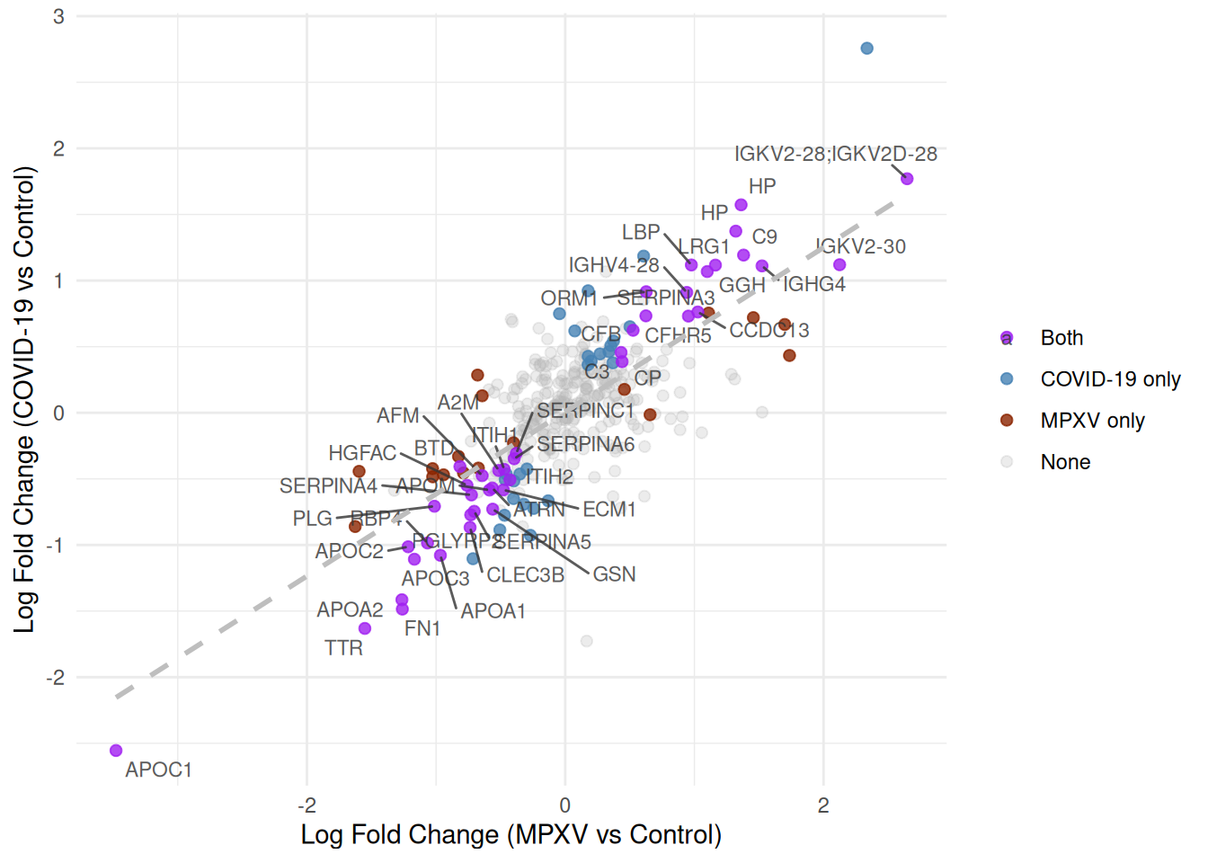
Finally, we map transparency (alpha) to the significance category to draw the eye towards proteins significant in both contrasts, and add a linear regression line with geom_smooth(method = 'lm') to show the overall relationship between log fold changes across the two infections.
What are we trying to learn from this scatter plot — what does a protein’s position in the plot tell us?
Which proteins are most interesting?
The plot includes a linear regression line. Is a standard linear model (Ordinary Least Squares; OLS) appropriate here, given that both axes represent quantities measured with error? What would be a better alternative?
TipKey Points
Heatmaps are a useful way to visualise protein abundance patterns across all samples simultaneously; restricting to significant or highly variable proteins makes them easier to interpret
The default Euclidean distance metric in pheatmap can be replaced with a correlation-based distance to focus clustering on the shape of abundance profiles; this requires computing the distance matrix manually when missing values are present
Ward’s minimum variance linkage (clustering_method = 'ward.D2') tends to produce more compact, evenly-sized clusters than the default complete linkage
Defining a helper function for repeated plotting tasks (such as heatmaps for different protein subsets) reduces code duplication and makes the analysis easier to extend
Scatter plots of log fold changes from two contrasts can reveal proteins with shared or condition-specific responses; reshaping results to wide format with pivot_wider is a convenient way to align values from different contrasts for comparison