Be able to visualise protein abundance for specific proteins of interest across experimental groups
Appreciate the use of Principal Component Analysis (PCA) for visualising key factors that contribute to sample variation
Complete PCA using the prcomp function from the stats package
Be able to use the subsetByFeature function to get data across all levels for a feature of interest
Having cleaned, aggregated, and normalised our data, we are now ready to explore the protein-level data before carrying out formal statistical testing. This includes visualising the abundance of specific proteins of interest, assessing overall sample structure using PCA, and tracing individual proteins across data levels to verify the processing pipeline has behaved as expected.
5.1 Plotting quantification values for proteins of interest
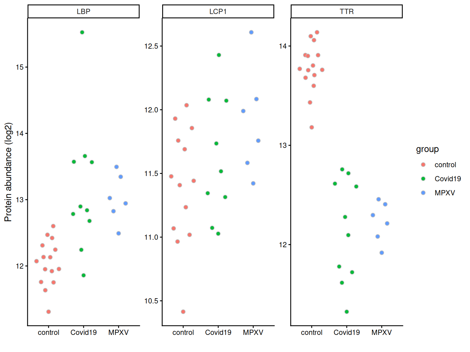
Often we are interested in the quantities of specific proteins, for example, proteins we expect to change in abundance based on prior biological knowledge. We can plot the quantification values for these proteins to inspect them directly before any formal statistical testing.
We first convert the protein-level data to long format using longForm, extracting both sample-level metadata (group, runCol) and feature-level metadata (gene names, protein names).
harmonizing input:
  removing 155 sampleMap rows not in names(experiments)
We can then filter to a set of proteins of interest and plot abundance values per sample, grouped by condition.
proteins_of_interest <-c('P02766', # TTR'P18428', # LBP'P13796') # LCP1long_form_protein %>%# filter to the proteins of interestfilter(UniprotID %in% proteins_of_interest) %>%# define aestheticsggplot(aes(x = group, y = value, fill = group)) +# Using quasirandom from ggbeeswarm to avoid overlapping pointsgeom_quasirandom(dodge.width =0.5, colour ='grey', pch =21, size =2) +# Summarise with mean +/- 95% confidence intervalstat_summary(fun.data = mean_cl_normal,position =position_dodge(width =0.5),show.legend =FALSE ) +theme_classic() +labs(x ='', y ='Protein abundance (log2)') +facet_wrap(~Genes, scales ='free')
5.2 Principal Component Analysis (PCA)
The final protein level exploration that we will do is Principal Component Analysis (PCA).
PCA is a statistical method that can be applied to condense complex data from large data tables into a smaller set of summary indices, termed principal components. This process of dimensionality reduction makes it easier to understand the variation observed in a dataset, both how much variation there is and what the primary factors driving the variation are. This is particularly important for multivariate datasets in which experimental factors can contribute differentially or cumulatively to variation in the observed data. PCA allows us to observe any trends, clusters and outliers within the data thereby helping to uncover the relationships between observations and variables.
5.2.1 The process of PCA
The process of PCA can be considered in several parts:
Scaling and centering the data
Firstly, all continuous variables are standardized into the same range so that they can contribute equally to the analysis. This is done by centering each variable to have a mean of 0 and scaling its standard deviation to 1.
Generation of a covariance matrix
After the data has been standardized, the next step is to calculate a covariance matrix. The term covariance refers to a measure of how much two variables vary together. For example, the height and weight of a person in a population will be somewhat correlated, thereby resulting in covariance within the population. A covariance matrix is a square matrix of dimensions p x p (where p is the number of dimensions in the original dataset i.e., the number of variables). The matrix contains an entry for every possible pair of variables and describes how the variables are varying with respect to each other.
Overall, the covariance matrix is essentially a table which summarises the correlation between all possible pairs of variables in the data. If the covariance of a pair is positive, the two variables are correlated in some direction (increase or decrease together). If the covariance is negative, the variables are inversely correlated with one increasing when the other decreases. If the covariance is near-zero, the two variables are not expected to have any relationship.
Eigendecomposition - calculating eigenvalues and eigenvectors
Eigendecomposition is a concept in linear algebra whereby a data matrix is represented in terms of eigenvalues and eigenvectors. In this case, the the eigenvalues and eigenvectors are calculated based on the covariance matrix and will inform us about the magnitude and direction of our data. Each eigenvector represents a direction in the data with a corresponding eigenvalue telling us how much variation in our data occurs in that direction.
Eigenvector = informs about the direction of variation
Eigenvalue = informs about the magnitude of variation
The number of eigenvectors and eigenvalues will always be equal to the number of samples in the dataset.
The calculation of principal components
Principal components are calculated by multiplying the original data by a corresponding eigenvector. As a result, the principal components themselves represent directionality of data. The order of the principal components is determined by the corresponding eigenvector such that the first principal component is that which explains the most variation in the data (i.e., has the largest eigenvalue).
By having the first principal components explain the largest proportion of variation in the data, the dimension of the data can be reduced by focusing on these principal components and ignoring those which explain very little in the data.
5.2.2 Completing PCA with prcomp
Discussion
Why do we need to remove proteins with missing values before running PCA?
How many proteins do you expect to lose by applying filterNA here, given what we observed about missingness in the earlier lesson?
What impact might this have on the PCA result and its biological interpretation?
Since PCA requires a complete data matrix, we first remove proteins with any missing values using filterNA. We then extract the normalised protein-level assay, transpose so that samples are rows, and pass to prcomp.
protein_pca <- dia_qf[["norm_proteins"]] %>%filterNA() %>%assay() %>%t() %>%prcomp(scale =TRUE, center =TRUE)summary(protein_pca)
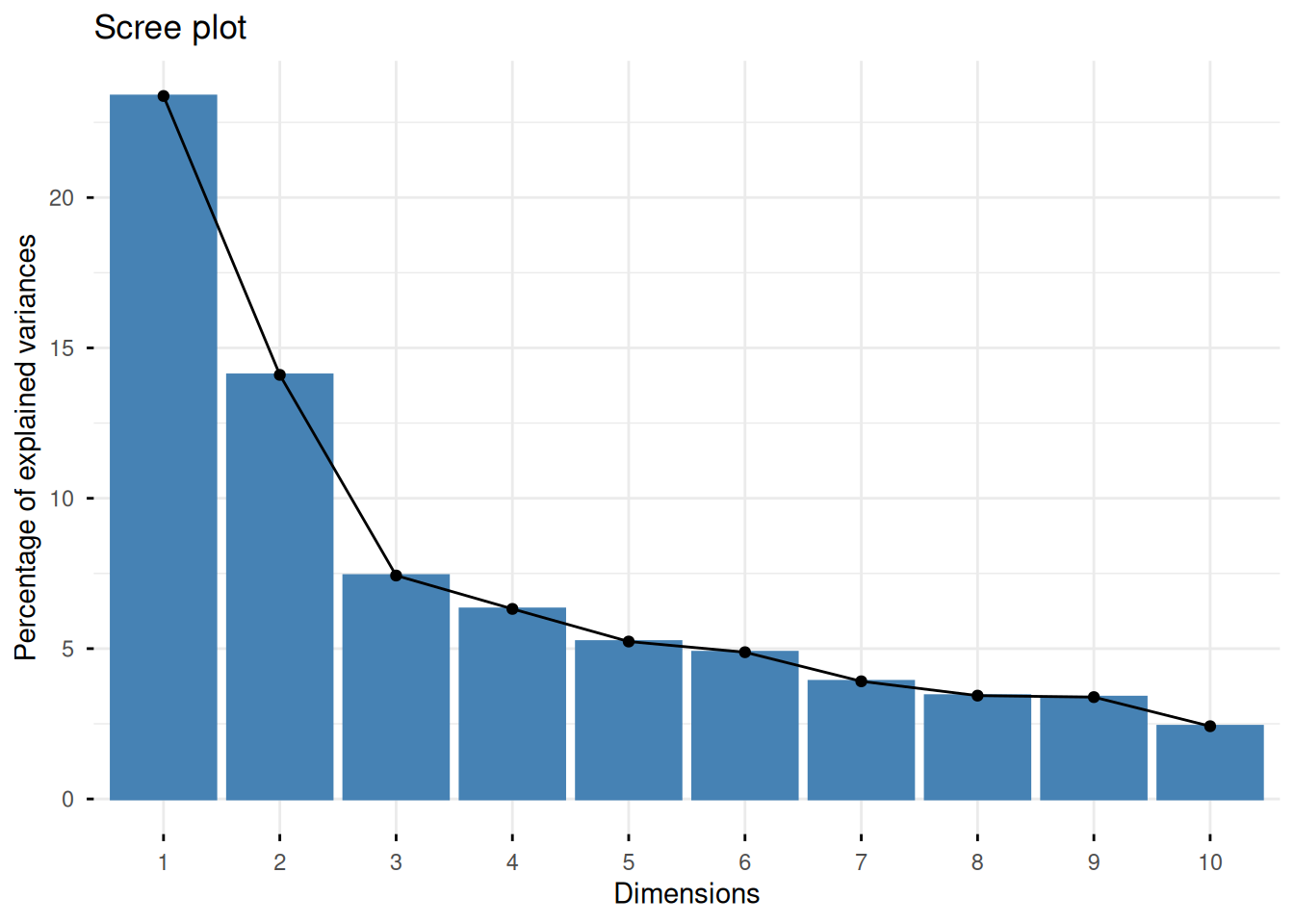
We plot a scree plot to inspect how much variance each PC explains.
fviz_screeplot(protein_pca)
Discussion
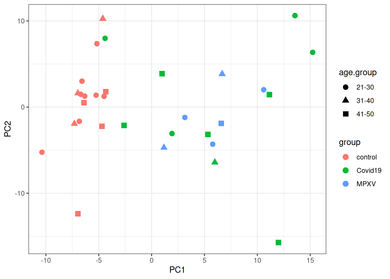
Looking at the PCA plot, which factor(s) appears to drive the most variation between samples? Is this what you expected based on the experimental design?
Are there any samples that look like outliers or behave differently? What might explain this?
We then plot the samples in PCA space, colouring by group and using shape to indicate age group.
p <- protein_pca$x %>%merge(colData(dia_qf), by ='row.names') %>%data.frame() %>%ggplot(aes(x = PC1, y = PC2, colour = group, shape = age.group)) +geom_point(size =3) +theme_bw()print(p)
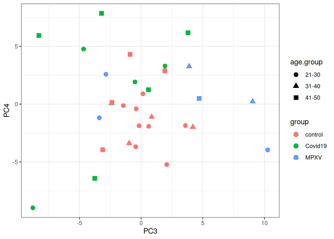
print(p +aes(x = PC3, y = PC4))
5.3 The subsetByFeature function
As well as visualising all proteins, it can be useful to extract all data levels corresponding to a specific protein of interest. The QFeatures infrastructure provides the subsetByFeature function to do this. It takes a QFeatures object and one or more feature names, and returns a new QFeatures object containing only data corresponding to those features.
Let’s look at TTR (Transthyretin; UniProt ID P02766), one of the proteins of interest plotted above.
ExperimentList class object of length 6:
 [1] precursors: SummarizedExperiment with 8 rows and 31 columns
 [2] precursors_no_cont: SummarizedExperiment with 8 rows and 31 columns
 [3] precursors_filtered_missing: SummarizedExperiment with 8 rows and 31 columns
 [4] precursors_filtered_missing_log: SummarizedExperiment with 8 rows and 31 columns
 [5] proteins: SummarizedExperiment with 1 rows and 31 columns
 [6] norm_proteins: SummarizedExperiment with 1 rows and 31 columns
From this we can see the dimensions of the TTR data at each data level, showing how many precursors support the protein-level quantification for this protein.
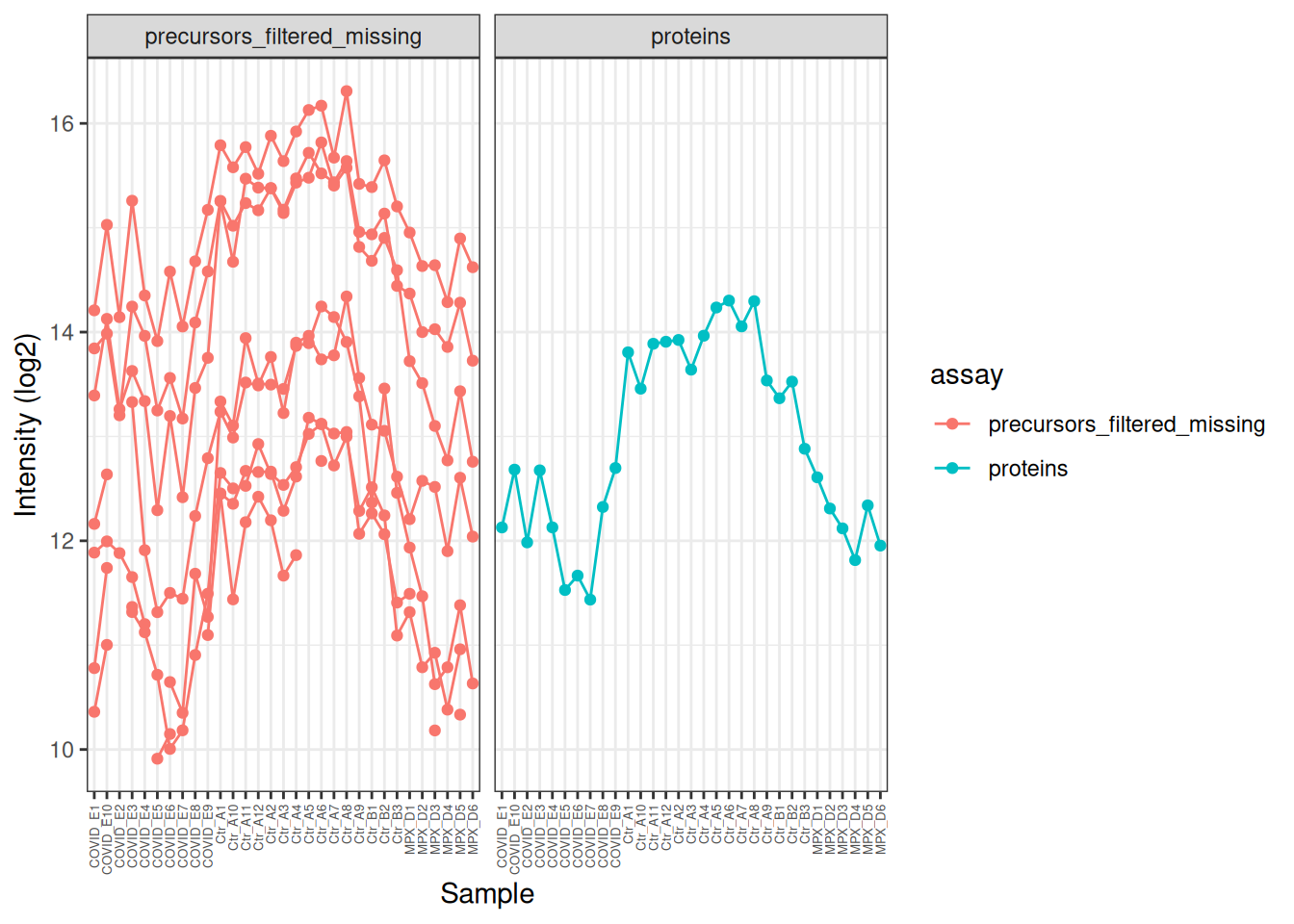
We can use this subset to visualise how the precursor data was aggregated to protein level for this particular feature. Note that some of the precursors were not quantified in all samples (broken lines in the plot), but the protein-level quantification is complete across all samples.
TTR[,, c("precursors_filtered_missing", "proteins")] %>%longForm() %>%as_tibble() %>%# Log2 transform the precursor-level data for better visualisationmutate(value =ifelse(assay =='precursors_filtered_missing', log2(value), value) ) %>%ggplot(aes(x = colname, y = value, colour = assay)) +geom_point() +geom_line(aes(group = rowname)) +theme_bw() +theme(axis.text.x =element_text(angle =90, vjust =0.5, hjust =1, size =5) ) +facet_wrap(~assay) +labs(x ='Sample', y ='Intensity (log2)')
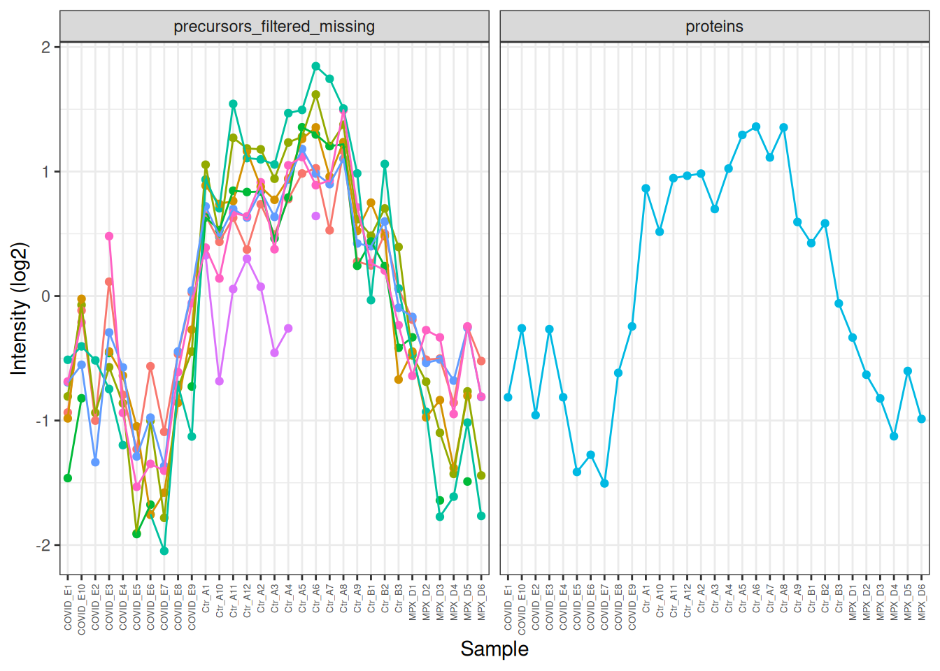
In the plot above, the profile of the precursors is very similar, but it’s hard to see this because of the differences in overall intensity. We can modify the intensities to put them on the same scale and make this clearer. Now we can clearly see how similar the precursor profiles are and how this is summarised in the protein-level quantification.
TTR[,, c("precursors_filtered_missing", "proteins")] %>%longForm() %>%as_tibble() %>%mutate(value =ifelse(assay =='precursors_filtered_missing', log2(value), value) ) %>%# Centre the values for each assay to put them on the same scalegroup_by(rowname) %>%mutate(value = value -mean(value, na.rm =TRUE)) %>%# colour by feature (rowname) to make it easier to distinguish the precursor profilesggplot(aes(x = colname, y = value, colour = rowname)) +geom_point() +geom_line(aes(group = rowname)) +theme_bw() +theme(axis.text.x =element_text(angle =90, vjust =0.5, hjust =1, size =5),legend.position ='none' ) +facet_wrap(~assay) +labs(x ='Sample', y ='Intensity (log2)')
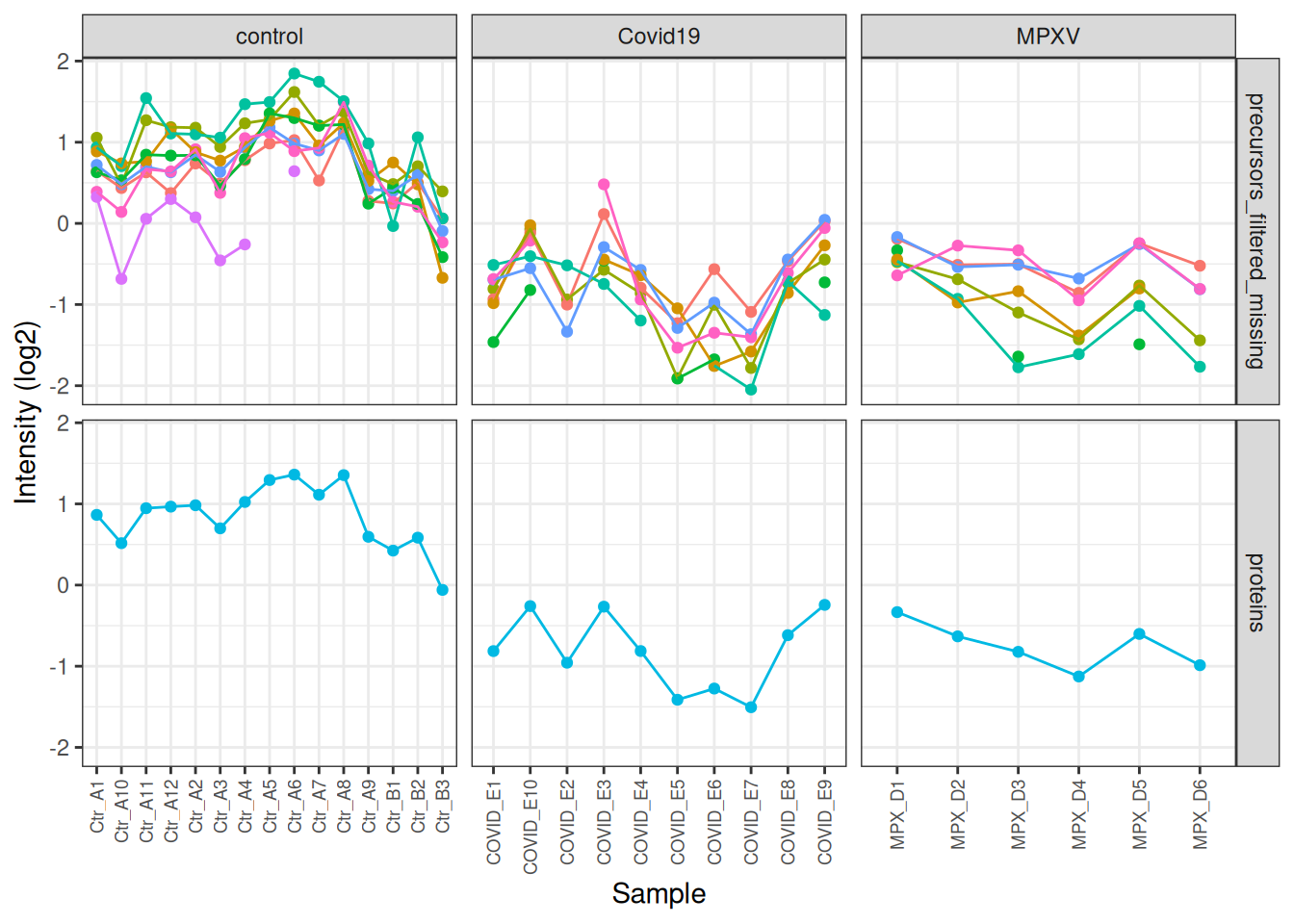
We can go one step further and also facet by condition so we can see the differences between the conditions more clearly.
harmonizing input:
  removing 124 sampleMap rows not in names(experiments)
Warning: Removed 34 rows containing missing values or values outside the scale range
(`geom_point()`).
Warning: Removed 24 rows containing missing values or values outside the scale range
(`geom_line()`).
TipKey Points
Plotting protein abundances for specific proteins of interest is a useful way to inspect the data before formal statistical testing
PCA wiht prcomp uses only the complete data matrix.
Colouring PCA plots by all potential sources of variation (e.g., group, age group) helps identify which factors drive the observed structure in the data
The subsetByFeature function provides a convenient way to extract all data levels for a protein of interest from a QFeatures object. We can use this to visualise how the precursor-level data was aggregated to protein level for a specific feature, and to verify that the processing pipeline has behaved as expected.