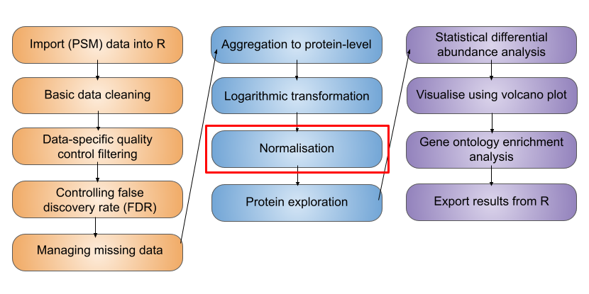
9 Exploring normalisation methods
TipLearning Objectives
- Use the
normalyzerfunction from theNormalyzerDEpackage (Willforss et al. (2018)) to explore the effect of different normalisation methods on the data
Note
This workflow is an adjunct to the Normalisation and aggregation section which demonstrates how to normalise proteomics data using the normalize function within the QFeatures infrastructure. Please first read through that material, since it includes background explanations and discussions which are not repeated here.
9.1 Using NormalyzerDE
Selecting an appropriate and optimal normalisation method will depend on the exact experimental design and data structure. Within the R Bioconductor packages, however, exists NormalyzerDE Willforss et al. (2018), a tool for evaluating different normalisation methods.
The NormalyzerDE package provides a function called normalyzer which is useful for getting an overview of how different normalisation methods perform on a dataset. The normalyzer function however requires a raw intensity matrix as input, prior to any log transformation. Therefore, to use this function we need a non-log protein-level dataset.
- Create a copy of your
cc_qfdataset for testing normalisation methods. Let’s call thisnorm_qf.
norm_qf <- cc_qf

norm_qf
An instance of class QFeatures (type: bulk) with 2 sets:
[1] psms_raw: SummarizedExperiment with 45803 rows and 10 columns
[2] psms_filtered: SummarizedExperiment with 25687 rows and 10 columns - Take the your data from the
psms_filteredlevel and create a new assay in yourQFeaturesobject (norm_qf) that aggregates the data from this level directly to protein level. Call this assay"proteins_direct".
norm_qf <- aggregateFeatures(norm_qf,
                             i = "psms_filtered",
                             fcol = "Master.Protein.Accessions",
                             name = "proteins_direct",
                             fun = base::colSums,
                             na.rm = TRUE)

## Verify
experiments(norm_qf)
ExperimentList class object of length 3:
[1] psms_raw: SummarizedExperiment with 45803 rows and 10 columns
[2] psms_filtered: SummarizedExperiment with 25687 rows and 10 columns
[3] proteins_direct: SummarizedExperiment with 3823 rows and 10 columns- Run the
normalyzerfunction on the newly created (untransformed) protein level data using the below code.
Note: To run normalyzer on this data we need to pass requireReplicates = FALSE as we have only one sample of the control. We pass the un-transformed data as the normalyzer function does an internal log2 transformation as part of its pipeline. For more details on using the NormalyzerDE package take a look at the package vignette.
normalyzer(jobName = "normalyzer",
           experimentObj = norm_qf[["proteins_direct"]],
           sampleColName = "sample",
           groupColName = "condition",
           outputDir = "normalyzer_output",
           requireReplicates = FALSE)
If your job is successful a new folder will be created in your working directory under outputs called normalyzer. Take a look at the PDF report.
The output report contains:
- Total intensity plot: Barplot showing the summed intensity in each sample for the log2-transformed data
- Total missing plot: Barplot showing the number of missing values found in each sample for the log2-transformed data
- Log2-MDS plot: MDS plot where data is reduced to two dimensions allowing inspection of the main global changes in the data
- Scatterplots: The first two samples from each dataset are plotted.
- Q-Q plots: QQ-plots are plotted for the first sample in each normalized dataset.
- Boxplots: Boxplots for all samples are plotted and colored according to the replicate grouping.
- Relative Log Expression (RLE) plots: Relative log expression value plots. Ratio between the expression of the variable and the median expression of this variable across all samples. The samples should be aligned around zero. Any deviation would indicate discrepancies in the data.
- Density plots: Density distributions for each sample using the density function. Can capture outliers (if single densities lies far from the others) and see if there is batch effects in the dataset (if for instance there is two clear collections of lines in the data).
- MDS plots: Multidimensional scaling plot using the
cmdscale()function from thestatspackage. Is often able to show whether replicates group together, and whether there are any clear outliers in the data. - Dendograms: Generated using the
hclustfunction. Data is centered and scaled prior to analysis. Coloring of replicates is done usingas.phylofrom theapepackage.
9.2 Interpreting the results of Normalyzer
When interpreting our normalyzer output we need to consider our experimental design. If all samples come from the same cells and we don’t expect the treatment/conditions to cause huge changes to the proteome, we expect the distributions of the intensities to be roughly the same. We can compare across samples by plotting the distribution in each sample together. When doing this you should get an idea of where the majority of the intensities lie. We expect samples from the same condition to have intensities that lie in the same range and if they do not then we can assume that this is due to technical noise, and we want to normalise for this technical variability.
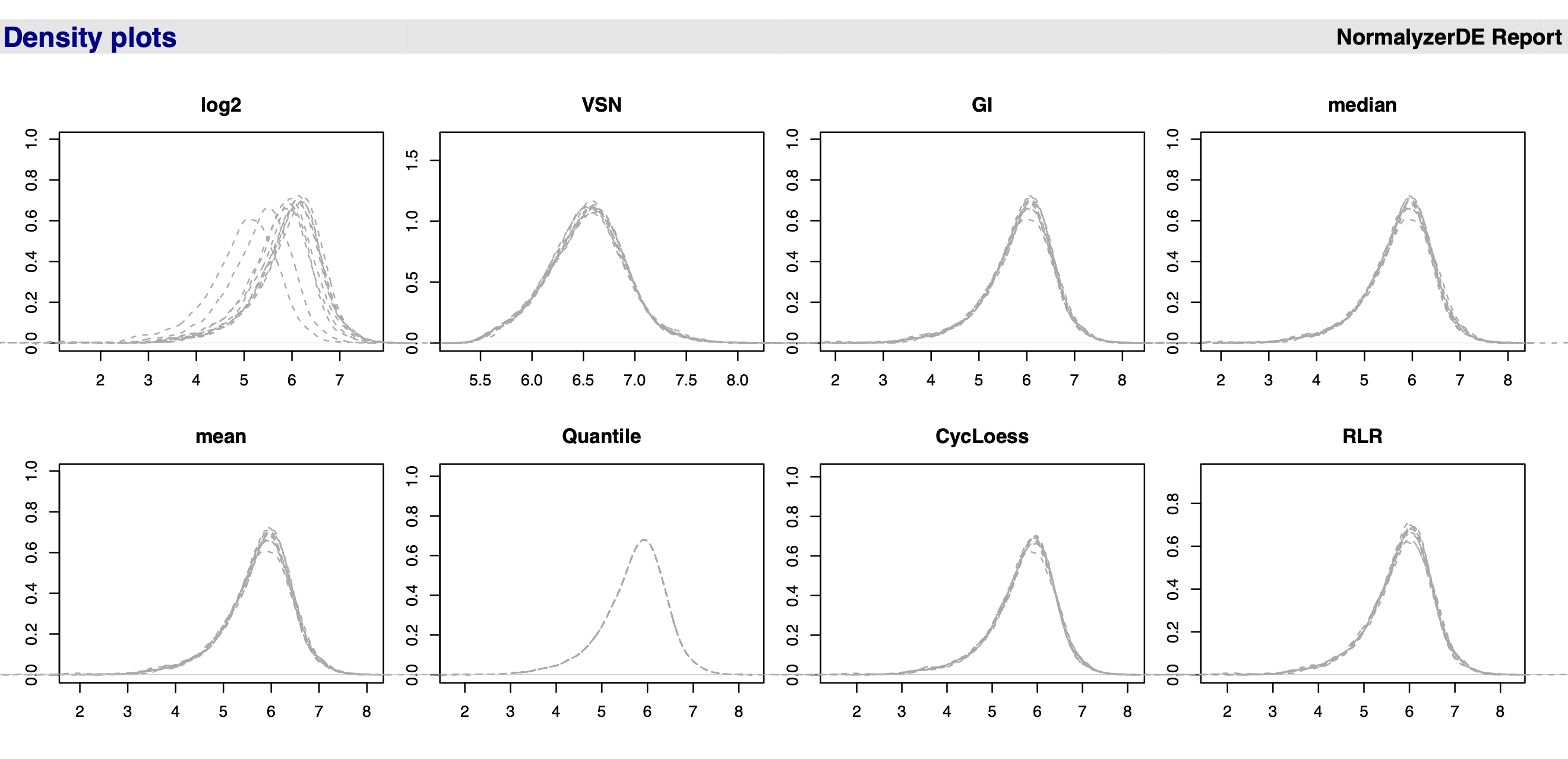
Figure 9.1 shows a screenshot of the PDF report output from running the normalyzer pipeline. We see that the data before normalisation (log2, topleft) has curves/peaks at different locations and what we want to do is try and register the curves at the same location.
Which method to choose? For the use-case data, there is no clear differences when applying different normalisation methods within normalyzer. Really you need to look at the underlying summary statistics. For example, the mean is very sensitive to outliers and in proteomics we often have outliers, so this is not a method we would choose. The median (or median-based methods) are a good choice for most quantitative proteomics data. Quantile normalisation is not recommended for quantitative proteomics data. Quantile methods will not change the median but will change all quantiles of the distribution so that all distributions coincide. We could do this but this often causes problems due to the fact that we have missing data in proteomics. This makes the normalisation even more challenging than in other omics types of data.
The decision is ultimately up to the user, but it is often best to explore different normalisation methods and their impact on the data.
References
Willforss, Jakob, Aakash Chawade, and Fredrik Levander. 2018. “NormalyzerDE: Online Tool for Improved Normalization of Omics Expression Data and High-Sensitivity Differential Expression Analysis.” Journal of Proteome Research 18 (2): 732–40. https://doi.org/10.1021/acs.jproteome.8b00523.