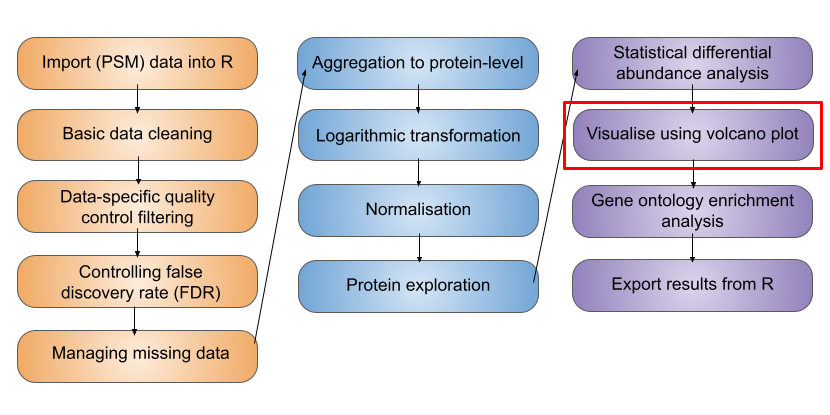
6 Statistical analysis
TipLearning Objectives
- Acknowledge the availability of different R/Bioconductor packages for carrying out differential expression (abundance) analyses
- Using the
limmapackage, design a statistical model to test for differentially abundant proteins between two conditions - Interpret the output of a statistical model and annotate the results with user-defined significance thresholds
- Produce volcano plots and heatmaps to explore the results of differential expression analyses
6.1 Differential expression analysis
Having cleaned our data, aggregated from PSM to protein level, completed a log2 transformation and normalised the data, we are now ready to carry out statistical analysis.
To simply the statistical analysis, we will focus on just two conditions here: M and G1 cell cycle stages. For a more complete statistical analysis of all cell cycles stages, please see the Statistical analysis of all 3 cell cycle stages section.
The aim of this section is to answer the question: “Which proteins show a significant change in abundance between M and G1?”.
Our null hypothesis is: (H0) The change in abundance for a protein between cell cycle stages is 0.
Our alternative hypothesis is: (H1) The change in abundance for a protein between cell cycle stages is not 0.
We want to perform a statistical test to determine if there is sufficient evidence to reject the null hypothesis. This is carried out on each protein separately, though as we will see, all proteins are tested simultaneously and there is some sharing of information between the proteins.
6.2 Selecting a statistical test
There are a few aspects of our data that we need to consider prior to deciding which statistical test to apply.
- The protein abundances in this data are not normally distributed (i.e., they do not follow a Gaussian distribution). However, they are approximately normal following a log-transformation.
- The cell cycle is not expected to have a large impact on biological variability. We can assume that the variance is approximately equal across the groups.
- The samples are independent not paired. For example, M_1 is not derived from the same cells as G1_1 and DS_1.
The first point relates to a key assumption that is made when carrying out Gaussian Linear modeling, which assumes that the residuals (difference between the observed values and the values predicted by the model) are Gaussian distributed. If this assumption is not met, then it is not appropriate to use a Gaussian Linear model. For quantitative proteomics data, it’s reasonable to assume the residuals will be approximately Gaussian distributed if we first log-transform the abundances.
Many different R packages can be used to carry out differential expression (abundance) analysis on proteomics data. Here we will use limma, a package that is widely used for omics analysis and can be used in single comparisons or multifactorial experiments using an empirical Bayes-moderated linear model. A simple example of the empirical Bayes-moderated linear model is provided in Hutchings et al. (2024).
Here, we will perform a comparison between two groups (M and G1 phases) for each protein. For a multifactorial comparison of all cell cycle stages, see Statistical analysis of all 3 cell cycle stages.
6.2.1 What does the empirical Bayes part mean?
When carrying out high throughput omics experiments we not only have a population of samples but also a population of features - here we have several thousand proteins. Proteomics experiments are typically lowly replicated (e.g n < 10), therefore, the per-protein variance estimates are relatively inaccurate. The empirical Bayes method borrows information across features (proteins) and shifts the per-protein variance estimates towards an expected value based on the variance estimates of other proteins with a similar abundance. This improves the accuracy of the variance estimates, thus reducing false negatives for proteins with over-estimated variance and reducing false positives from proteins with under-estimated variance. For more detail about the empirical Bayes methods, see here.
6.3 Extracting the required data
We subset to our log2 transformed protein-level data and retain just the M and G1 phase samples
# extract the log-normalised experiment from our QFeatures object
all_proteins <- cc_qf[["log_norm_proteins"]]

# subset to retain only M and G1 samples
all_proteins <- all_proteins[, all_proteins$condition %in% c("M", "G1")]

## Ensure that conditions are stored as levels of a factor with
## explicitly defined levels
all_proteins$condition <- factor(all_proteins$condition,
                                 levels = c("M", "G1"))
6.4 Defining the statistical model
Before we apply our empirical Bayes moderated linear model, we first need to set up a model. To define the model design we use model.matrix. A model matrix, also called a design matrix, is a matrix in which rows represent individual samples and columns correspond to explanatory variables, in our case the cell cycle stages. Simply put, the model design is determined by how samples are distributed across conditions.
Below, we define the model matrix with condition as the explanatory variable.
## Design a matrix containing all factors that we wish to model
condition <- all_proteins$condition

m_design <- model.matrix(~condition) # Model with intercept
Inspecting the design matrix, we can see that we have a coefficient called (Intercept) and a coefficient called conditionG1. The first level of the variable (here, M) is considered the ‘baseline’ and modeled by the intercept. The second level of the variable (here, G1) is then modeled by an additional term in the model, which captures the difference between M and G1. This is the most appropriate way to model the data since the term conditionG1 captures the difference we are interested in.
## Inspect the design matrix
m_design
(Intercept) conditionG1
1 1 0
2 1 0
3 1 0
4 1 1
5 1 1
6 1 1
attr(,"assign")
[1] 0 1
attr(,"contrasts")
attr(,"contrasts")$condition
[1] "contr.treatment"
NoteWhat happens if we don’t include an intercept?
When investigating the effect of a single explanatory variable, the design matrix should be created using model.matrix(~variable), such that an intercept term is included and the other model term captures the difference we are interested in.
If we specified a model without an intercept (model.matrix(~0 + variable)), the resultant coefficients in the model will capture the difference between each group (M or G1) and zero. Given our null hypothesis relates to the difference between the groups, not between each group and zero, this is not want we want! We could still use contrasts to explore the differences between the groups an intercept term in our model, but it’s simpler to work with a model which inherently estimates this difference.
6.5 Running an empirical Bayes-moderated test using limma
After we have specified the design matrix, the next step is to apply the statistical model
## Fit linear model using the design matrix and desired contrasts
fit_model <- lmFit(object = assay(all_proteins), design = m_design)
The initial model has now been applied to each of the proteins in our data. We now update the model using the eBayes function. When we do this we include two other arguments: trend = TRUE and robust = TRUE.
trend- takes a logical value ofTRUEorFALSEto indicate whether an intensity-dependent trend should be allowed for the prior variance (i.e., the population level variance prior to empirical Bayes moderation). This means that when the empirical Bayes moderation is applied the protein variances are not squeezed towards a global mean but rather towards an intensity-dependent trend.robust- takes a logical value ofTRUEorFALSEto indicate whether the parameter estimation of the priors should be robust against outlier sample variances.
See (Phipson et al. (2016) and Smyth (2004)) for further details.
## Update the model using the limma eBayes algorithm

final_model <- eBayes(fit = fit_model,
                      trend = TRUE,
                      robust = TRUE)
6.5.1 Accessing the model results
The topTable function extracts a table of the top-ranked proteins from our fitted linear model. By default, topTable outputs a table of the top 10 ranked proteins, that is the 10 proteins with the highest log-odds of being differentially abundant. To get the results for all of our proteins we use the number = Inf argument.
## Format results
limma_results <- topTable(fit = final_model,
                          coef = 'conditionG1',
                          adjust.method = "BH",    # Method for multiple hypothesis testing
                          number = Inf) %>%        # Print results for all proteins
  rownames_to_column("Protein")

## Verify
head(limma_results)
Protein logFC AveExpr t P.Value adj.P.Val B
1 Q9NQW6 -2.077921 2.641270 -40.40812 1.139582e-15 4.356623e-12 25.79468
2 Q9BW19 -2.343592 1.430210 -36.79774 4.073530e-15 7.786553e-12 24.71272
3 P49454 -1.991326 2.598481 -34.88623 8.411188e-15 9.266757e-12 24.07905
4 Q9ULW0 -2.152503 2.476087 -34.52309 9.695796e-15 9.266757e-12 23.95341
5 Q562F6 -3.205603 -1.304111 -32.91865 1.849860e-14 1.414403e-11 23.37677
6 O14965 -2.098029 0.797902 -31.22180 3.791132e-14 2.415583e-11 22.72604Depending on whether the linear model is used to perform single comparisons or multifactorial comparisons, the test statistic for each protein will either be a t-value or an F-value, respectively. Here, we are performing a single comparison (M vs G1), so we obtain a t-value. We also obtain the p-value from the comparison of the t-value with a t-distribution.
NoteWhat is a t-value?
A t-value is a parametric statistical value used to compare the mean values of two groups. The t-value is the ratio of the difference in means to the standard error of the difference in means. The further away from zero that a t-value lies, the more significant the difference between the groups is.
NoteHow is the p-value obtained?
A p-value may be obtained from a t-value by comparing the value against a t-distribution with the appropriate degrees of freedom.
- degrees of freedom = the number of observations minus the number of independent variables in the model
- p-value = the probability of achieving the t-value under the null hypothesis i.e., by chance
We also see an adjusted p-value (adj.P.Val) column. This provides p-values adjusted to account for the multiple hypothesis tests performed.
6.5.2 Multiple hypothesis testing and correction
Using the linear model defined above, we have carried out a statistical test for each protein.
Multiple testing describes the process of separately testing multiple null hypothesis i.e., carrying out many statistical tests at a time, each to test a null hypothesis on different data. Here we have carried out 3823 hypothesis tests. If we were to use the typical p < 0.05 significance threshold for each test, we would expect a 5% chance of incorrectly rejecting the null hypothesis per test. Here, we would expect approximately 191 p-values <= 0.05 by chance.
If we do not account for the fact that we have carried out multiple hypothesis, we risk including false positives in our data. Many methods exist to correct for multiple hypothesis testing and these mainly fall into two categories:
- Control of the Family-Wise Error Rate (FWER)
- Control of the False Discovery Rate (FDR)
Above we specified the “BH” method for adjusting p-values in our topTable function call. This is shorthand for the Benjamini-Hochberg procedure, to control the FDR.
TipThe False Discovery Rate
The False Discovery Rate (FDR) defines the fraction of false discoveries that we are willing to tolerate in our list of differential proteins. For example, an FDR threshold of 0.05 means that approximately 5% of the proteins deemed differentially abundant will be false positives. It is up to you to decide what this threshold should be, but conventionally a value between 0.01 (1% FPs) and 0.1 (10% FPs) is chosen.
6.5.3 Diagnostic plots to verify suitability of our statistical model
As with all statistical analysis, it is crucial to do some quality control and to check that the statistical test that has been applied was indeed appropriate for the data. As mentioned above, statistical tests typically come with several assumptions. To check that these assumptions were met and that our model was suitable, we create some diagnostic plots.
The first plot that we generate is an SA plot to display the residual standard deviation (sigma) versus log abundance for each protein to which our model was fitted. We can use the plotSA function to do this.
plotSA(fit = final_model,
       cex = 0.5,
       xlab = "Average log2 abundance")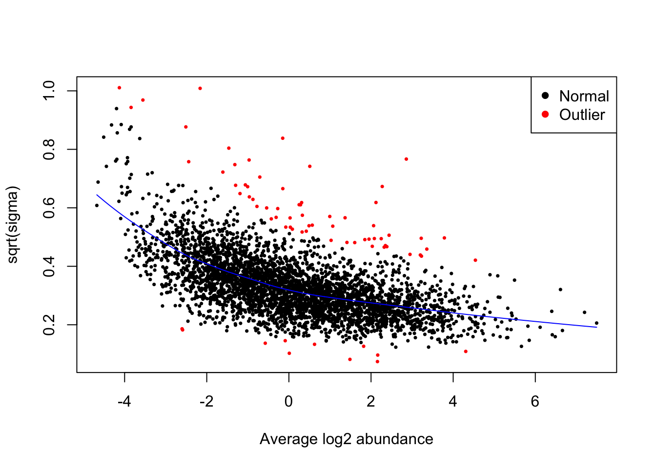
It is recommended that an SA plot be used as a routine diagnostic plot when applying a limma-trend pipeline. From the SA plot we can visualise the intensity-dependent trend that has been incorporated into our linear model. It is important to verify that the trend line fits the data well. If we had not included the trend = TRUE argument in our eBayes function, then we would instead see a straight horizontal line that does not follow the trend of the data. Further, the plot also colours any outliers in red. These are the outliers that are only detected and excluded when using the robust = TRUE argument.
Next, we plot a histogram of the raw p-values (not adjusted p-values). This can be done by passing our results data into standard ggplot2 plotting functions.
limma_results %>%
  as_tibble() %>%
  ggplot(aes(x = P.Value)) +
  geom_histogram()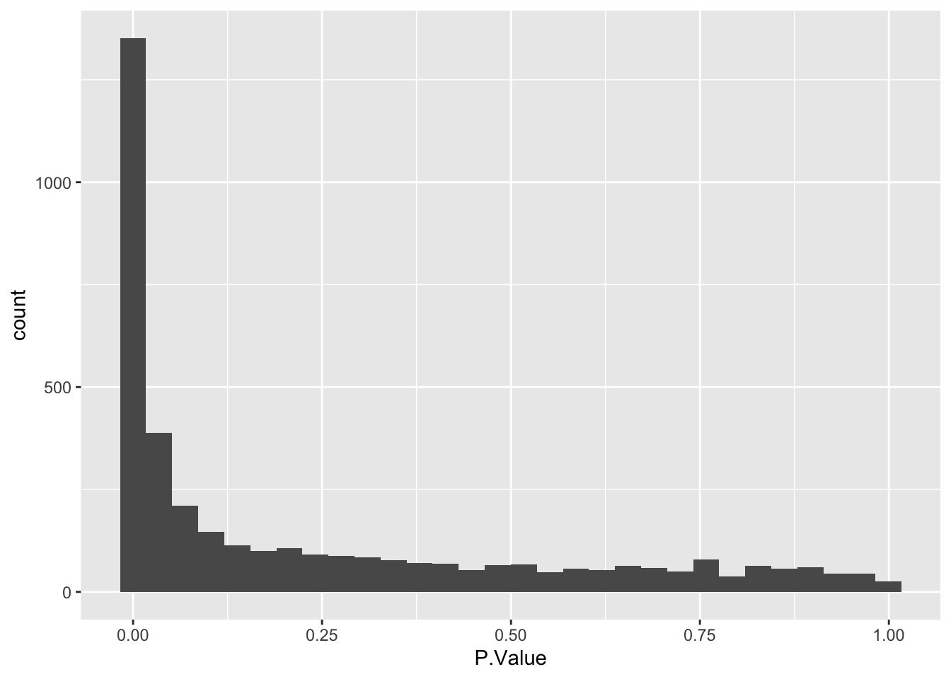
The histogram we have plotted shows an anti-conservative distribution, which is good. The near-flat distribution across the bottom corresponds to null p-values which are distributed approximately uniformly between 0 and 1. The peak close to 0 contains a combination of our significantly changing proteins (true positives) and proteins with a low p-value by chance (false positives).
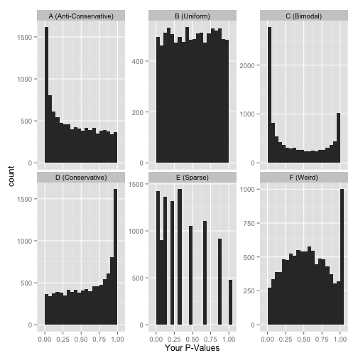
Other examples of how a p-value histogram could look are shown below. Whilst in some experiments a uniform p-value distribution may arise due to an absence of significant alternative hypotheses, other distribution shapes can indicate that something was wrong with the model design or statistical test. For more detail on how to interpret p-value histograms there is a great blog post by David Robinson, from which the examples below are taken.
6.5.4 Interpreting the output of our statistical model
Having checked that the model we fitted was appropriate for the data, we can now take a look at the results of our test
head(limma_results) Protein logFC AveExpr t P.Value adj.P.Val B
1 Q9NQW6 -2.077921 2.641270 -40.40812 1.139582e-15 4.356623e-12 25.79468
2 Q9BW19 -2.343592 1.430210 -36.79774 4.073530e-15 7.786553e-12 24.71272
3 P49454 -1.991326 2.598481 -34.88623 8.411188e-15 9.266757e-12 24.07905
4 Q9ULW0 -2.152503 2.476087 -34.52309 9.695796e-15 9.266757e-12 23.95341
5 Q562F6 -3.205603 -1.304111 -32.91865 1.849860e-14 1.414403e-11 23.37677
6 O14965 -2.098029 0.797902 -31.22180 3.791132e-14 2.415583e-11 22.72604Interpreting the output of topTable:
logFC= The observed log2FC for G1 vs M cell cycle stagesAveExpr= the average log abundance of the protein across samplest= eBayes moderated t-value. Interpreted in the same way as a normal t-value (see above).P.Value= Unadjusted p-valueadj.P.Val= FDR-adjusted p-value (note that this adjustment is only for multiple proteins, not multiple contrasts i.e., separate rather than global correction)
We have used the statistical test to ask “Does this protein show a significant change in abundance between M and G1 cell cycle stages?” for each protein.
Our null hypothesis is: (H0) The change in abundance for a protein between cell cycle stages is 0.
Our alternative hypothesis is: (H1) The change in abundance for a protein between cell cycle stages is greater than 0.
From our output we can see that some of our proteins have high t-values and low adjusted p-values (below any likely threshold of significance). These adjusted p-values tell us that these protein have a significantly different abundance across M and G1 cell cycle stages.
Adding user-defined significance thresholds
The output of our statistical test will provide us with key information for each protein, including its p-value, BH-adjusted p-value and logFC. However, it is up to us to decide what we consider to be significant. The first parameter to consider is the adj.P.Val threshold that we wish to apply. The second parameter which is sometimes used to define significance is the logFC. This is mainly because larger fold changes are deemed more likely to be ‘biologically relevant’.
Here we are going to define significance based on an adj.P.Val < 0.01. We can add a column to our results to indicate significance as well as the direction of change.
## Add direction and significance information
limma_results <- limma_results %>%
  mutate(direction = ifelse(logFC > 0, "up", "down"),
         significance = ifelse(adj.P.Val < 0.01, "sig", "not.sig"))


## Verify
head(limma_results)
Protein logFC AveExpr t P.Value adj.P.Val B
1 Q9NQW6 -2.077921 2.641270 -40.40812 1.139582e-15 4.356623e-12 25.79468
2 Q9BW19 -2.343592 1.430210 -36.79774 4.073530e-15 7.786553e-12 24.71272
3 P49454 -1.991326 2.598481 -34.88623 8.411188e-15 9.266757e-12 24.07905
4 Q9ULW0 -2.152503 2.476087 -34.52309 9.695796e-15 9.266757e-12 23.95341
5 Q562F6 -3.205603 -1.304111 -32.91865 1.849860e-14 1.414403e-11 23.37677
6 O14965 -2.098029 0.797902 -31.22180 3.791132e-14 2.415583e-11 22.72604
direction significance
1 down sig
2 down sig
3 down sig
4 down sig
5 down sig
6 down sig6.6 Visualising the results of our statistical model
The final step in any statistical analysis is to visualise the results. This is important for ourselves as it allows us to check that the data looks as expected.
The most common visualisation used to display the results of expression proteomics experiments is a volcano plot. This is a scatterplot that shows statistical significance (p-values) against the magnitude of fold change. Of note, when we plot the statistical significance we use the raw unadjusted p-value (-log10(P.Value)). This is because it is better to plot the statistical test results in their ‘raw’ form and not values derived from them (the adjusted p-value is derived from each p-value using the BH-method of correction). Furthermore, the process of FDR correction can result in some points that previously had distinct p-values having the same adjusted p-value. Finally, different methods of correction will generate different adjusted p-values, making the comparison and interpretation of values more difficult.
limma_results %>%
  ggplot(aes(x = logFC, y = -log10(P.Value), fill = significance)) +
  geom_point(shape = 21, stroke = 0.25, size = 3) +
  theme_bw()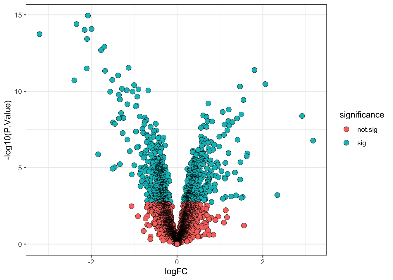
ExerciseExercise 1 - Challenge: Volcano plots
Level:
Re-generate your volcano plot defining significance based on an adjusted P-value < 0.01 and a log2 fold-change of > 1.
AnswerAnswer
my_results <-
  limma_results %>%
  mutate(direction = ifelse(logFC > 0, "up", "down"),
         significance = ifelse(adj.P.Val < 0.01 & abs(logFC) > 1, "sig", "not.sig"))

my_results %>%
  ggplot(aes(x = logFC, y = -log10(P.Value), fill = significance)) +
  geom_point(shape = 21, stroke = 0.25, size = 3) +
  theme_bw()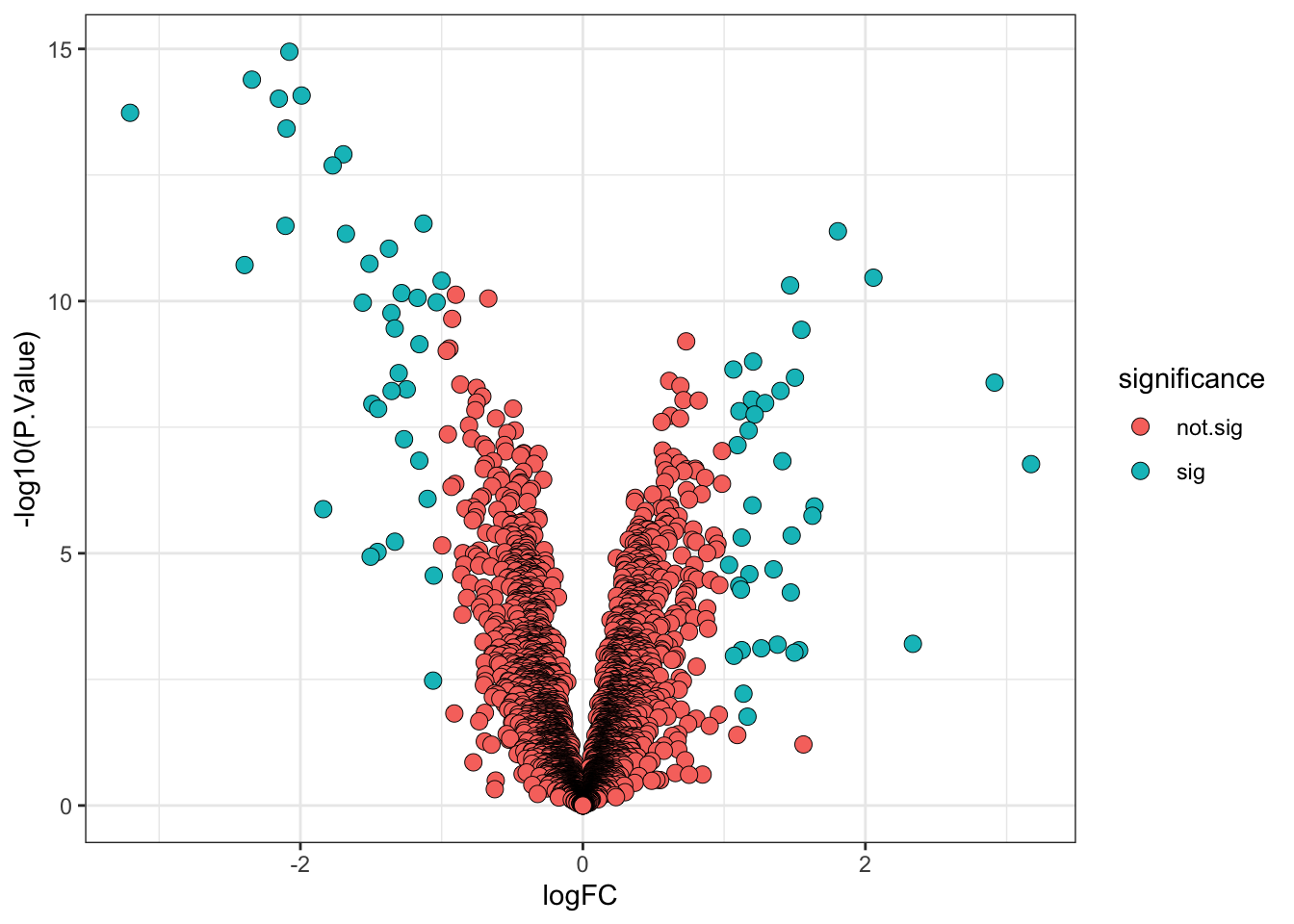
6.7 A more statistically valid way to include a fold-change threshold
Although it is commonplace to see a threshold being applied to the point estimate for the log fold-change (logFC) to determine the ‘biologically significant’ changes, there is a drawback. The point estimate does not take into account the confidence interval for the logFC. As such, proteins with poorly estimated fold-changes are more likely to pass the logFC threshold by chance, while proteins with very well estimated fold-changes which fall just below the threshold would not be deemed biologically significant.
Thankfully, limma has in-built functions which allows us to specify a different null hypothesis and more appropriately test whether a protein has a fold-change greater than a given value. This test whether the fold-change is greater than a specific value is more stringent than a post-hoc threshold on the point estimate and it thus makes sense to use a slightly lower threshold. Here we will use a threshold of absolute logFC > 0.5 (>1.4 fold-change).
final_model_treat <- treat(final_model,
                           lfc = 0.5, # null hypothesis is 'absolute logFC < 0.5'
                           trend = TRUE,
                           robust = TRUE)

# We now need to use TopTreat in place of TopTable
limma_results_treat <- topTreat(final_model_treat,
                                coef = "conditionG1",
                                n = Inf) %>%
  rownames_to_column("Protein")
Again, we add columns specifying the direction of change and significance (using the adjusted p-value alone).
## Add direction and significance information
limma_results_treat <- limma_results_treat %>%
  mutate(direction = ifelse(logFC > 0, "up", "down"),
         significance = ifelse(adj.P.Val < 0.01, "sig", "not.sig"))
Finally, we visualise the volcano plot.
limma_results_treat %>%
  ggplot(aes(x = logFC, y = -log10(P.Value), fill = significance)) +
  geom_point(shape = 21, stroke = 0.25, size = 3) +
  theme_bw()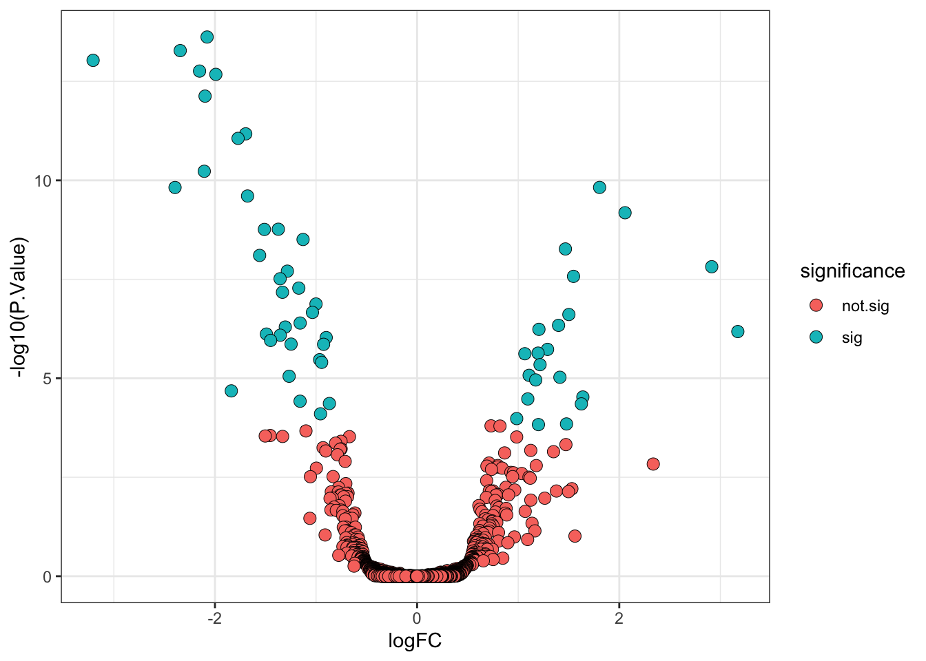
ExerciseExercise 2 - Challenge: Compare logFC thresholding post-hoc with LogFC null hypothesis
Level:
- Compare the overall results for each logFC thresholding approach by creating a 2 x 2 table with the number of proteins with increased/decreased abundance and significant/not significant change, for each approach.
- Identify the proteins which are significant when using the TREAT functions to define a logFC threshold for the null hypothesis but not when thresholding on the logFC post-hoc. You can use the existing
my_resultsandlimma_results_treatobjects for this. - Re-make the volcano plots for the two logFC thresholding approaches, but this time with the proteins identified above highlighted by the point shape. > 1.
AnswerAnswer
# Tabulate direction of change and significance
# for both logFC threshold approaches
table(my_results$direction,
      my_results$significance)
       not.sig  sig
  down    1792   35
up 1961 35table(limma_results_treat$direction,
limma_results_treat$significance)
       not.sig  sig
  down    1791   36
  up      1974   22
# Identify the proteins which are significant using
# TREAT, but not with the post hoc threshold on fold-change
post_hoc_not_sig <- my_results %>%
filter(significance == 'not.sig') %>%
pull(Protein)
treat_sig <- limma_results_treat %>%
filter(significance == 'sig') %>%
pull(Protein)
sig_treat_only <- intersect(post_hoc_not_sig, treat_sig)# Make a volcano plot highlighting these proteins
my_results %>%
# Add a new column to annotate the proteins to highlight
mutate(highlight = Protein %in% sig_treat_only) %>%
# Use the highlight column to control the shape aesthetic
ggplot(aes(x = logFC, y = -log10(P.Value),
fill = significance,
shape = highlight)) +
geom_point(stroke = 0.25, size = 3) +
# Define the shapes
scale_shape_manual(values = c(21, 8),
name = 'Post-hoc logFC\nthresh. sig. only') +
guides(fill = guide_legend(override.aes = list(shape=21))) +
theme_bw()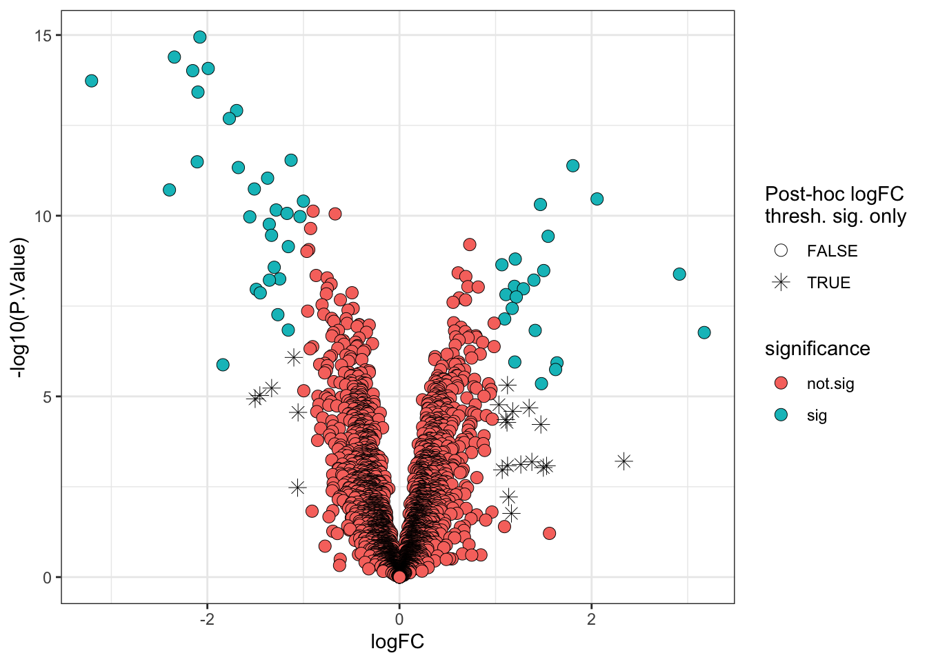
limma_results_treat %>%
  mutate(highlight = Protein %in% sig_treat_only) %>%
  ggplot(aes(x = logFC, y = -log10(P.Value),
             fill = significance,
             shape = highlight)) +
  geom_point(stroke = 0.25, size = 3) +
  scale_shape_manual(values = c(21, 8),
                     name = 'Post-hoc logFC\nthresh. sig. only') +
  guides(fill = guide_legend(override.aes = list(shape=21))) +
  theme_bw()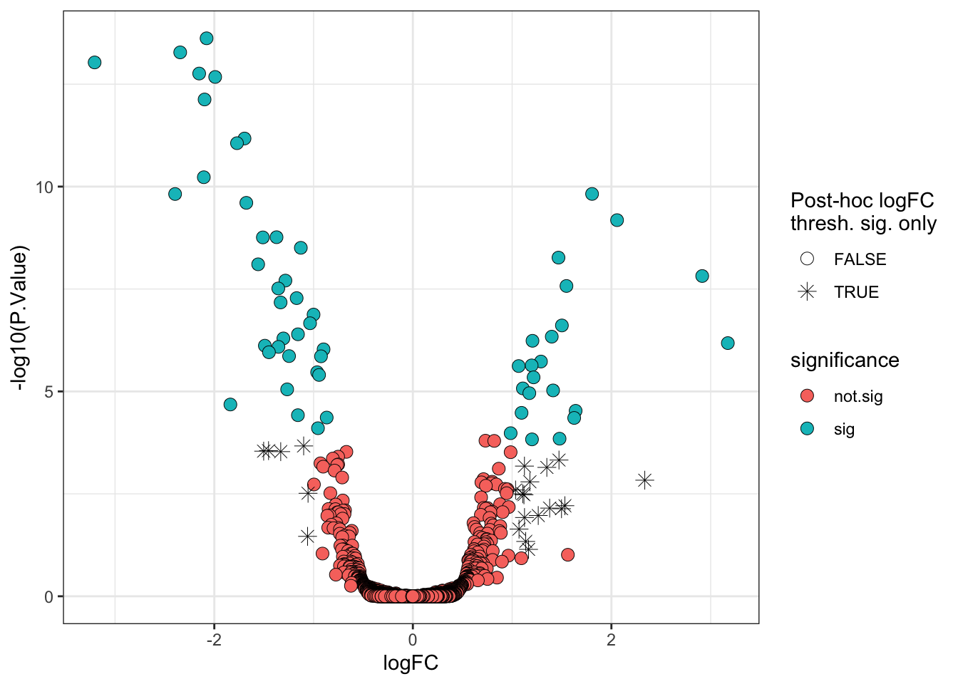
6.8 Visualising the protein abundances in a heatmap
Another widely used visualisation tool is a heatmap. A heatmap is a two-dimensional representation of our quantitative data where the magnitude of values are depicted by colour. These visualisations are commonly combined with clustering tools to facilitate the identification of groups of features, here proteins, that display similar quantitative behaviour. Here, we will use the pheatmap function from the pheatmap package to plot a heatmap of proteins that display a significant difference in abundance between M-phase and G1-phase cells. Note that we will plot all samples though, not just M and G1 phase samples.
We first extract the accessions of proteins with significant differences. We use these accessions to subset the original quantification data which is currently stored in the assay of our cp_qf object.
## Extract accessions of significant proteins
sig_proteins <- limma_results %>%
  filter(significance == "sig") %>%
  pull(Protein)

## Subset quantitative data corresponding to significant proteins
quant_data <- cc_qf[["log_norm_proteins"]]

quant_data <- quant_data[sig_proteins, ] %>% assay()
Now we use the quantitative data to plot a heatmap using pheatmap. We will normalise each row of protein abundances to Z-scores (standard deviations away from the mean).
pheatmap(mat = quant_data,
         scale = 'row', # Z-score normalise across the rows (proteins)
         show_rownames = FALSE)  # Too many proteins to show all their names!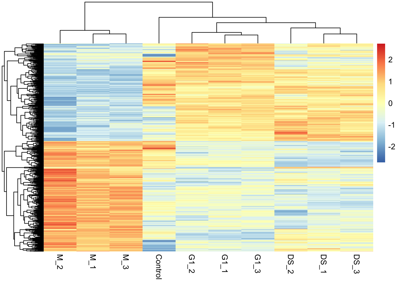
A more in-depth overview of pheatmap and how to customise these plots further can be found in the documentation (?pheatmap) and here.
TipKey Points
- The
limmapackage provides a statistical pipeline for the analysis of differential expression (abundance) experiments - Empirical Bayes moderation involves borrowing information across proteins to squeeze the per-protein variance estimates towards an expected value based on the behavior of other proteins with similar abundances. This method increases the statistical power and reduces the number of false positives.
- Since proteomics data typically shows an intensity-dependent trend, it is recommended to apply empirical Bayes moderation with
trend = TRUEandrobust = TRUE. The validity of this approach can be assessed by plotting an SA plot. - Significance thresholds are somewhat arbitrary and must be selected by the user. However, correction must be carried out for multiple hypothesis testing so significance thresholds should be based on adjusted p-values rather than raw p-values.
- The statistically appropriate way to threshold based on a log fold-change is to use the TREAT functions in
limmaand define a null hypothesis that the change is below a given value. - The results of differential expression and abundance analyses are often summarised with volcano plots and heatmaps.
References
Hutchings, Charlotte, Charlotte S. Dawson, Thomas Krueger, Kathryn S. Lilley, and Lisa M. Breckels. 2024. “A Bioconductor Workflow for Processing, Evaluating, and Interpreting Expression Proteomics Data.” F1000Research 12 (September): 1402. https://doi.org/10.12688/f1000research.139116.2.
Phipson, Belinda, Stanley Lee, Ian J. Majewski, Warren S. Alexander, and Gordon K. Smyth. 2016. “Robust Hyperparameter Estimation Protects Against Hypervariable Genes and Improves Power to Detect Differential Expression.” The Annals of Applied Statistics 10 (2). https://doi.org/10.1214/16-aoas920.
Smyth, Gordon K. 2004. “Linear Models and Empirical Bayes Methods for Assessing Differential Expression in Microarray Experiments.” Statistical Applications in Genetics and Molecular Biology 3 (1): 1–25. https://doi.org/10.2202/1544-6115.1027.